Web analytics dashboard examples and reporting templates
Turn complex website data into clear business intelligence with interactive web analytics dashboards for your team. These customizable visualization tools bring together metrics from Google Analytics 4 and Search Console into intuitive reports. Uncover hidden patterns in user journeys, pinpoint your highest-converting traffic channels, and share executive-ready insights across your organization—all without manual data work.
Web Analytics dashboard examples for every need


 +6
+6


 +5
+5
 +6
+6


 +4
+4
 +4
+4


about your case. It doesn't cost you a penny 😉
What is a web analytics dashboard?
The most effective web analytics dashboards bridge the gap between technical data and business outcomes. They transform abstract metrics like "sessions" and "pageviews" into meaningful stories about customer journeys and revenue opportunities. With white-label web analytics dashboards powered by Coupler.io, teams can distribute powerful insights through customized, brand-consistent reports. The dashboards remain continuously refreshed without manual intervention, providing real-time intelligence that keeps pace with your digital presence.

Choose your Web Analytics dashboard template to kick off
What reports should be included on a meaningful web analytics dashboard?
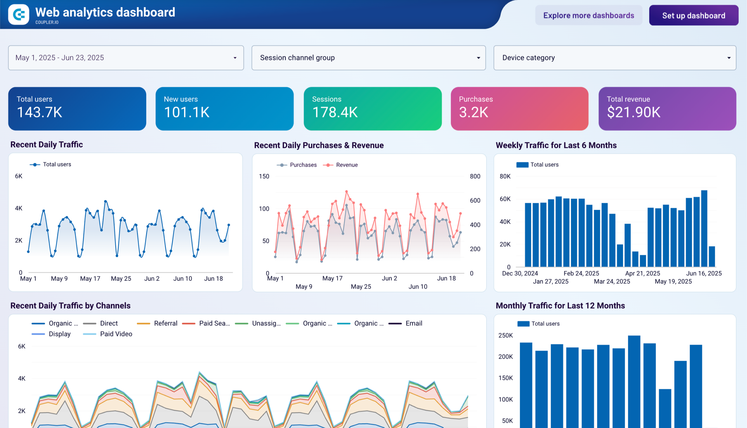
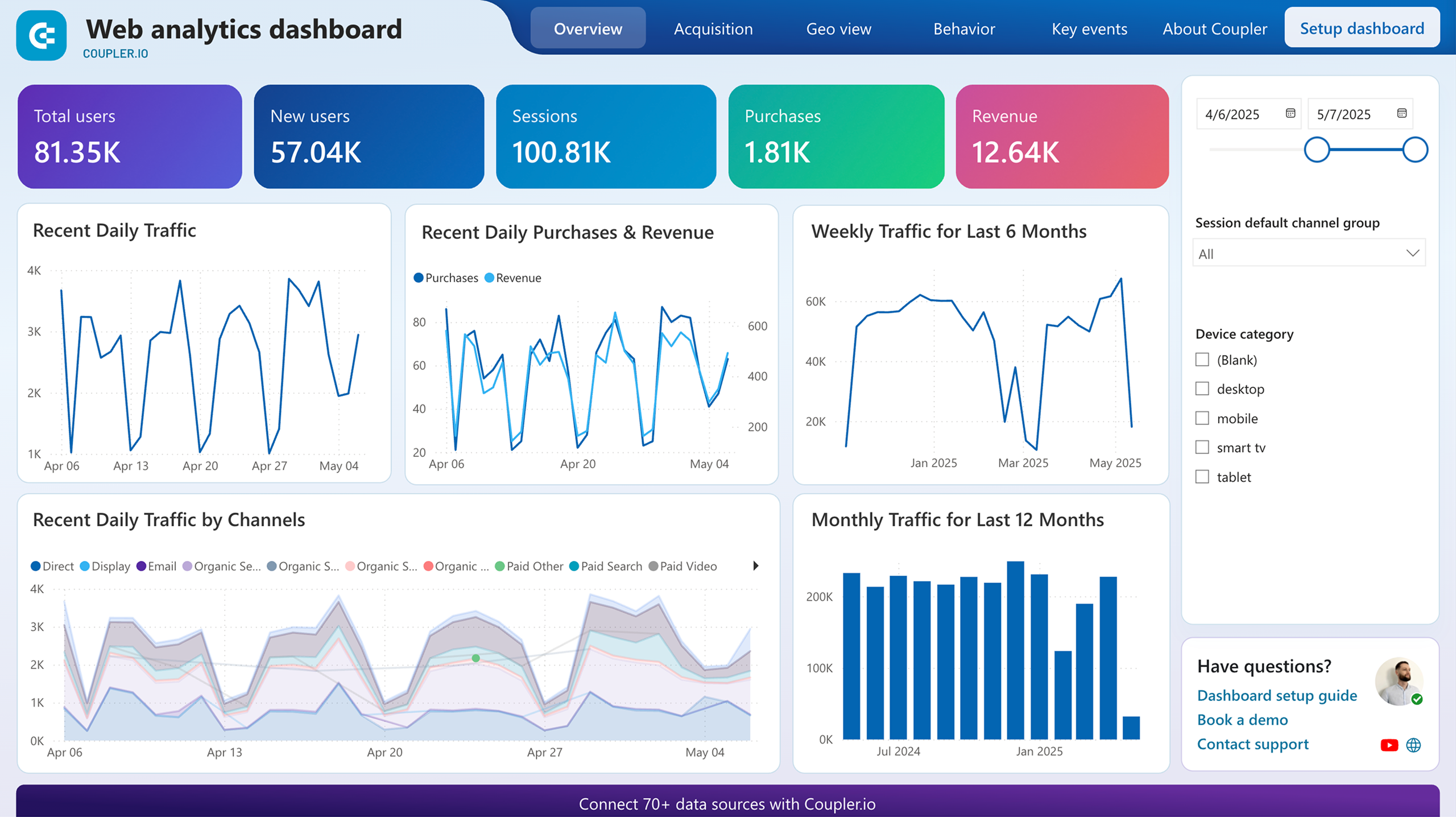
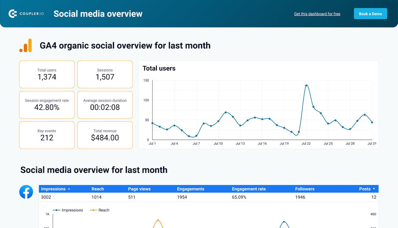
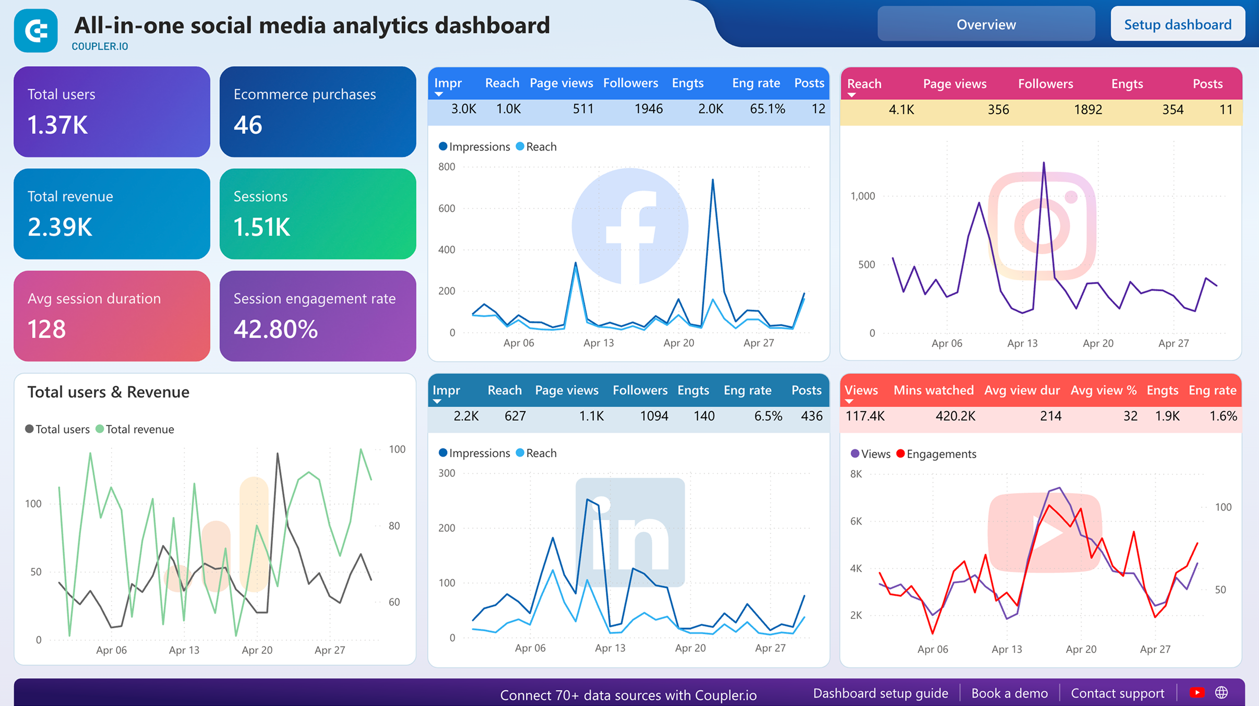
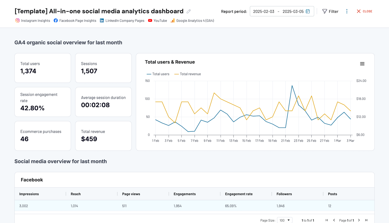
A comprehensive web analytics reporting dashboard should include several key reports that provide complete visibility into your website's performance. Based on our analysis of Google Analytics 4-based dashboards, we recommend incorporating these four essential report types:
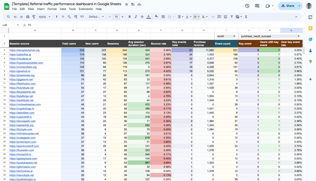
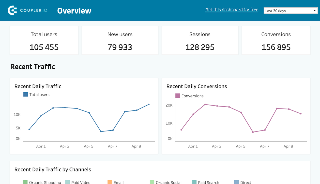
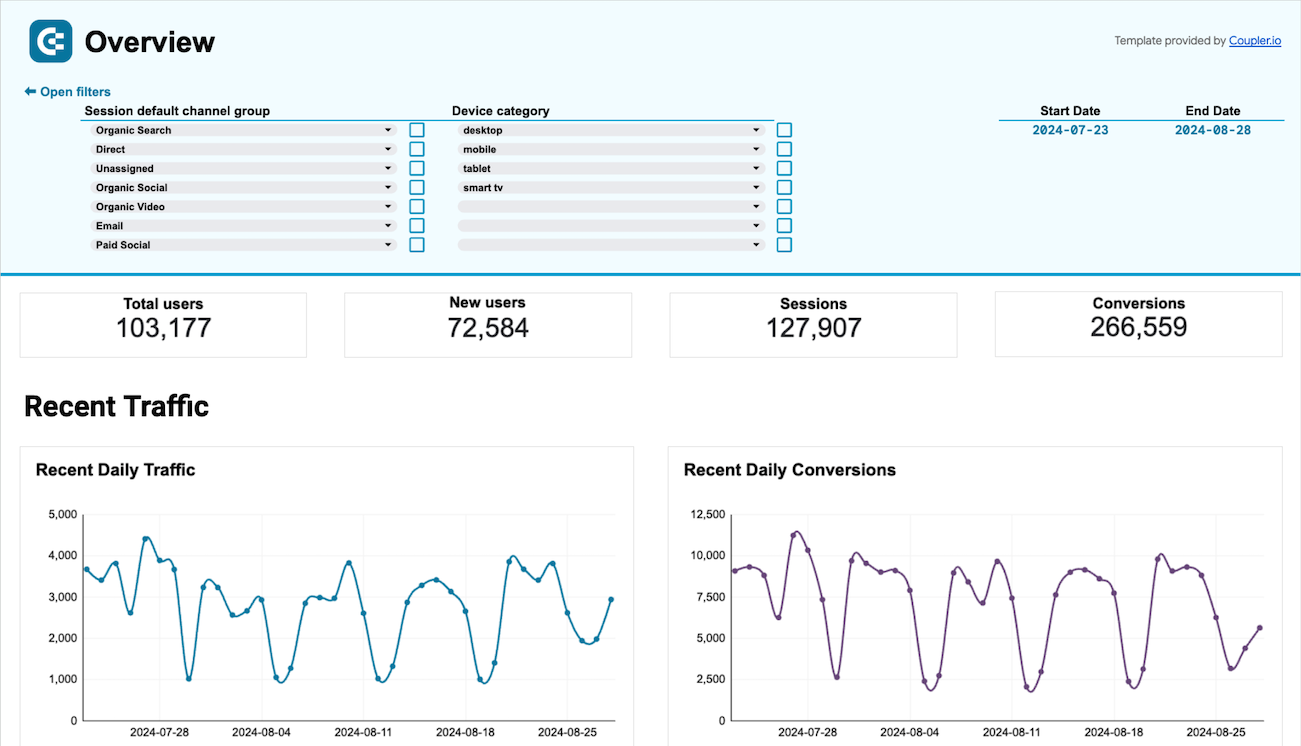
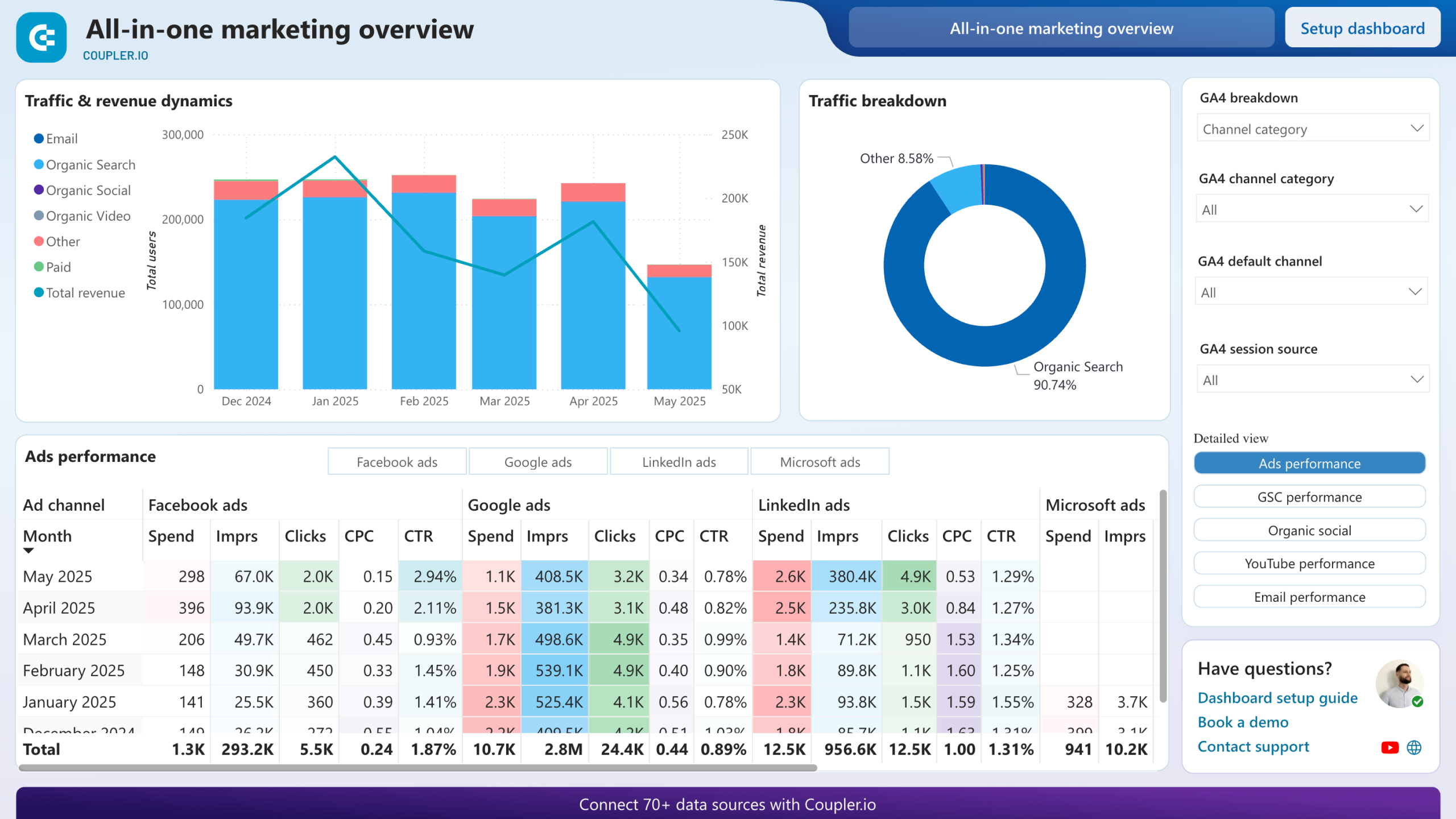
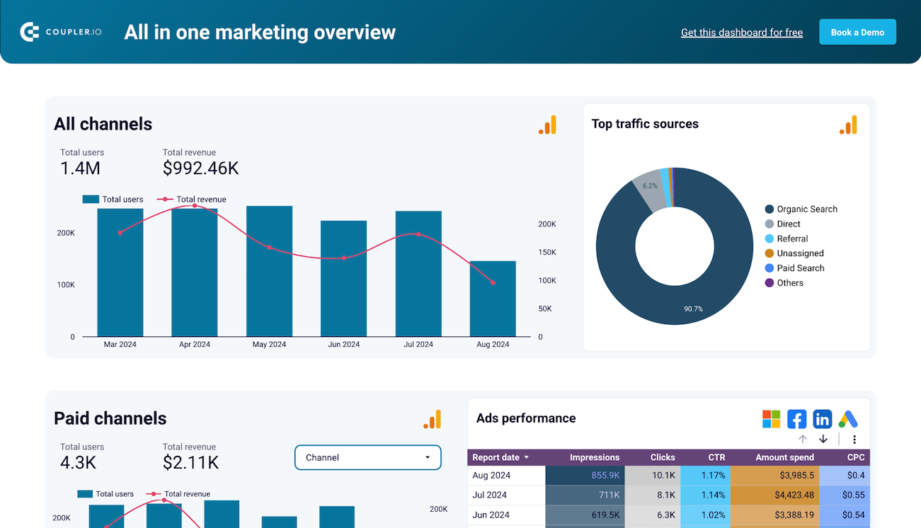
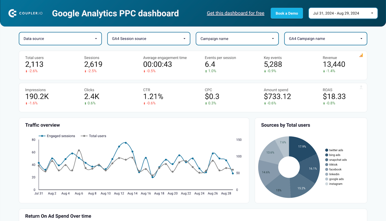
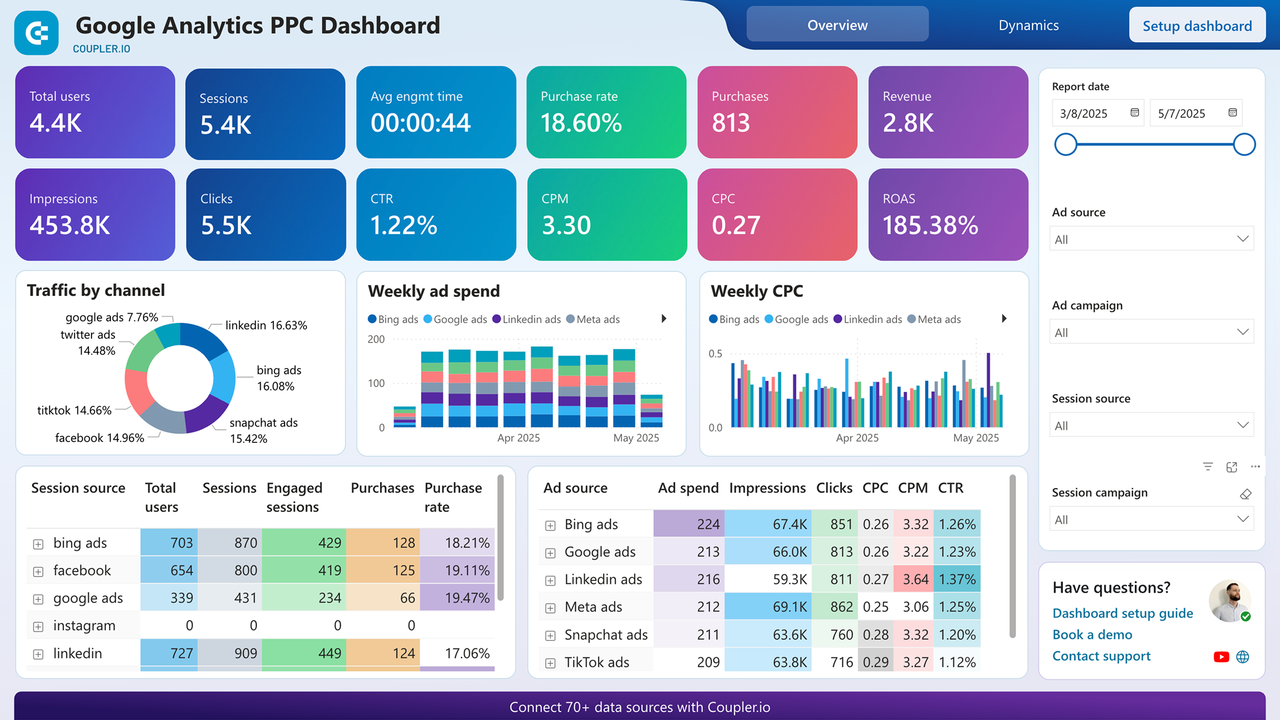
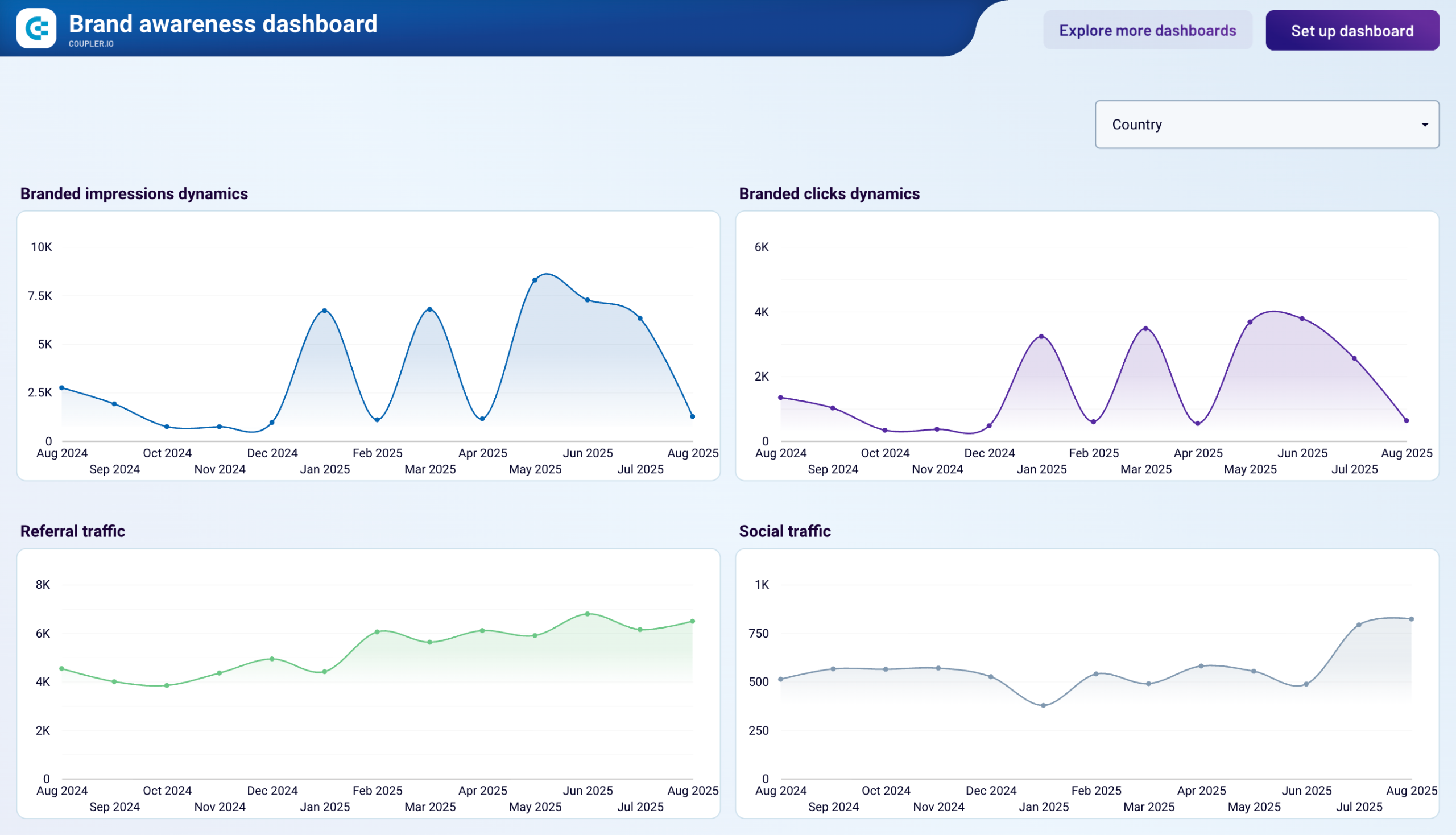
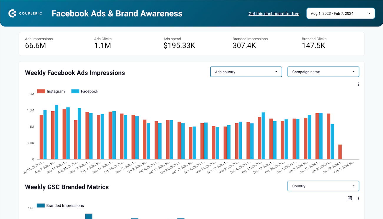
The traffic acquisition report serves as the foundation of web analytics, showing where your visitors come from and how different channels contribute to overall traffic. This report breaks down sessions by source (organic search, paid campaigns, social media, referrals, direct, and email), revealing which channels drive the most engagement. With trend analysis across time periods, you can identify growth patterns, seasonal fluctuations, and the impact of marketing initiatives on website traffic. A Looker Studio web analytics dashboard excels at visualizing these channel comparisons with intuitive color-coding and interactive filters.
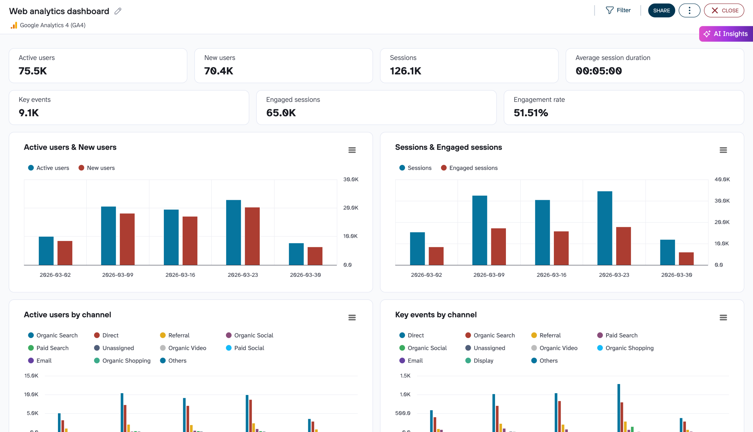
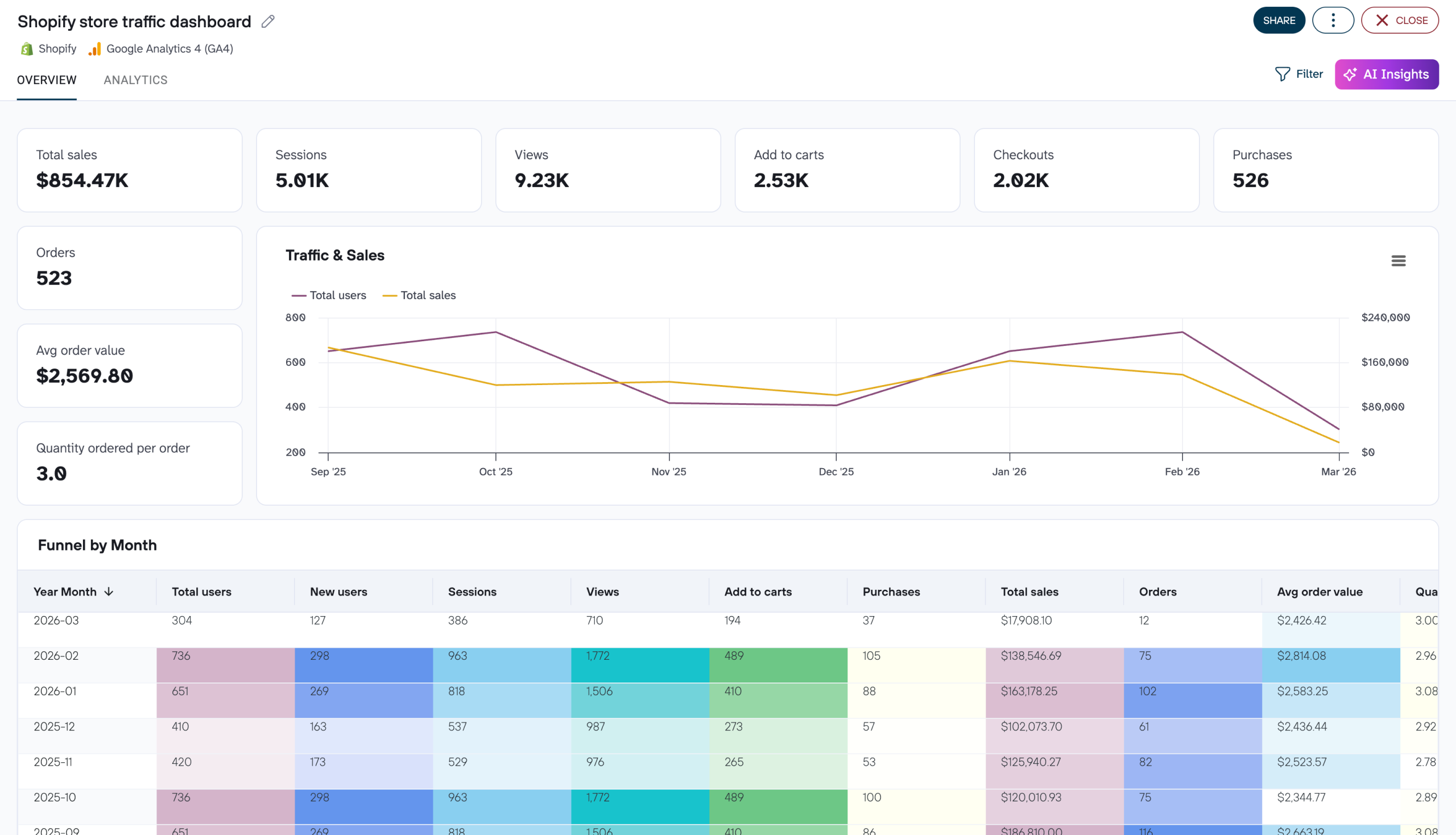
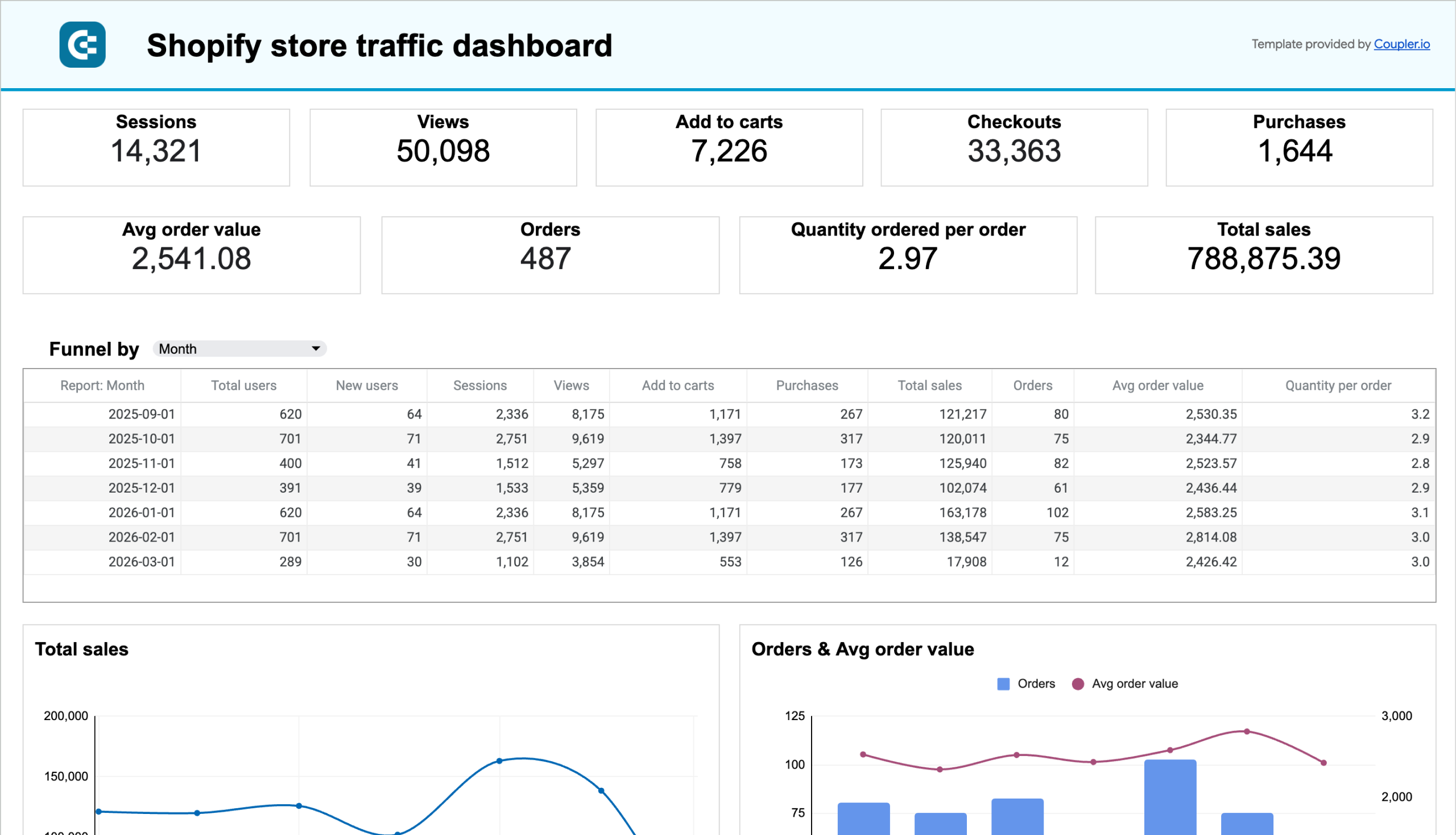
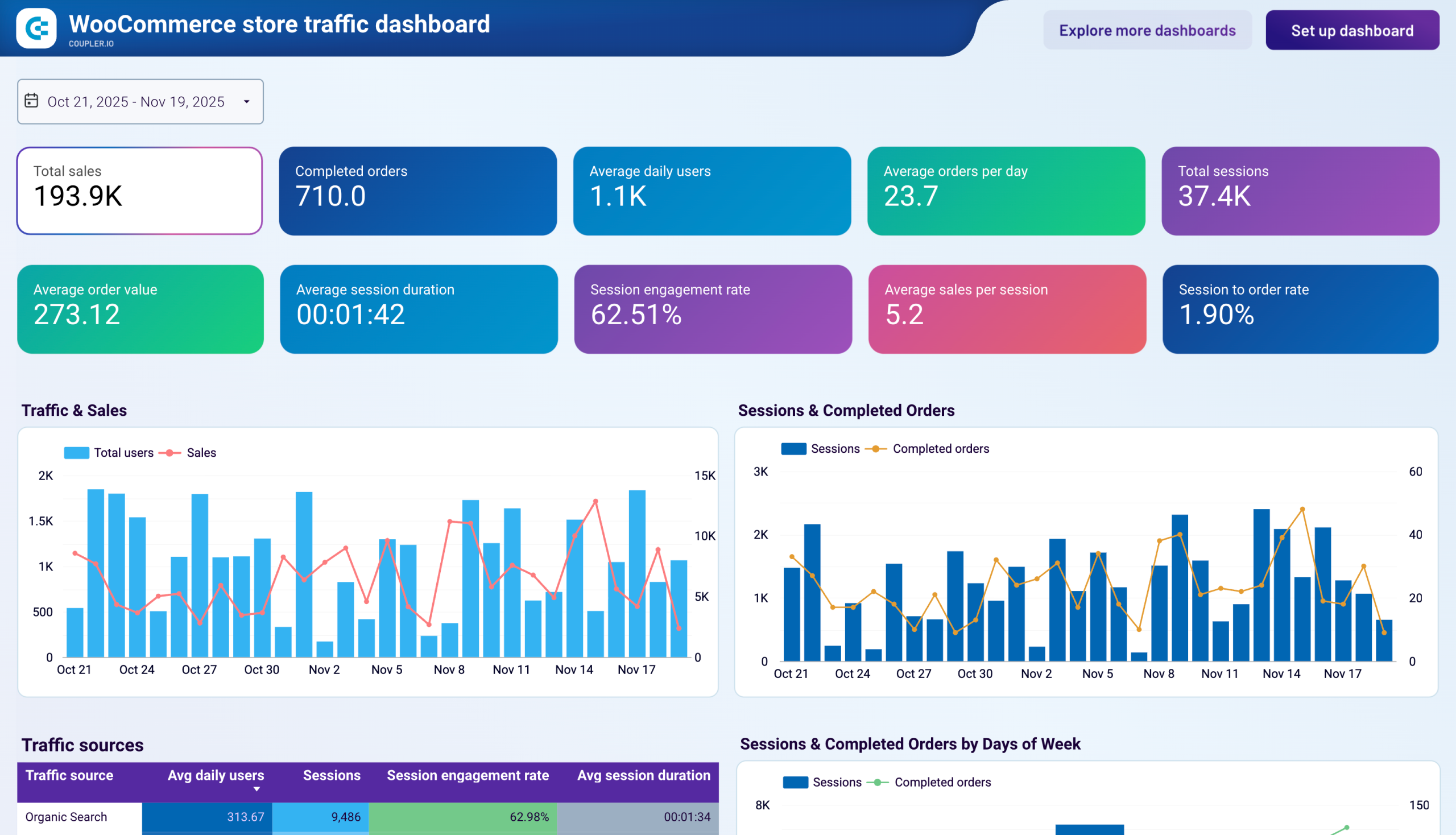
The user behavior report reveals how visitors interact with your website once they arrive. It tracks metrics like average session duration, pages per session, and bounce rates across different segments. The report highlights which content captures attention and which pages cause users to leave. By visualizing user flows and identifying common paths through your site, this report helps optimize the user experience and content strategy to encourage deeper engagement with your brand. Power BI web analytics dashboard solutions offer robust drilling capabilities to explore these behavior patterns in depth.
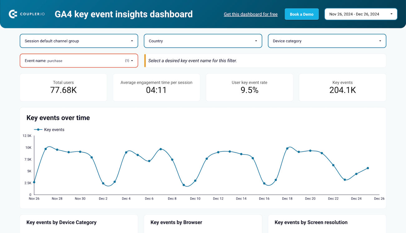
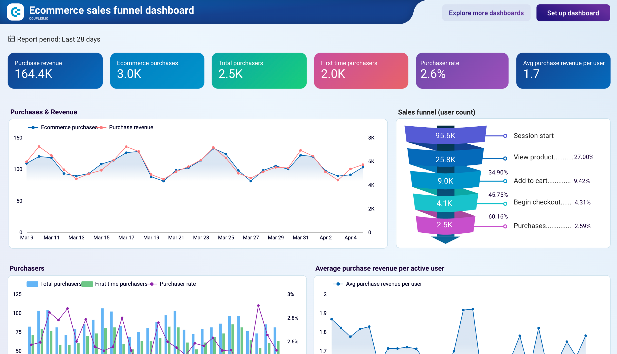
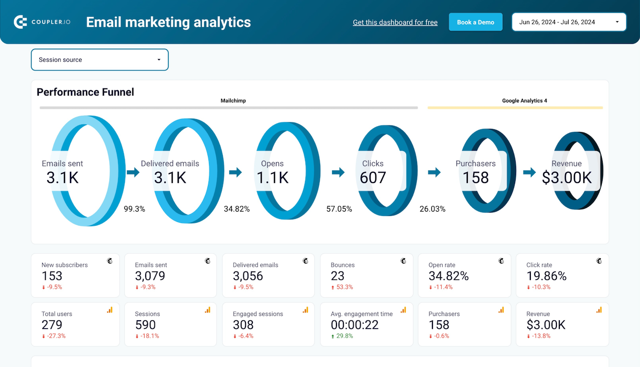
The conversion tracking report connects website activity to business outcomes by monitoring specific events that matter to your organization. Whether you're tracking purchases, sign-ups, downloads, or form submissions, this report shows conversion rates across different segments and channels. It reveals which traffic sources deliver not just visitors, but valuable customers. The report also provides attribution insights to understand the full customer journey, from first interaction to final conversion. An executive dashboard web analytics view typically emphasizes these conversion metrics to highlight bottom-line impact.
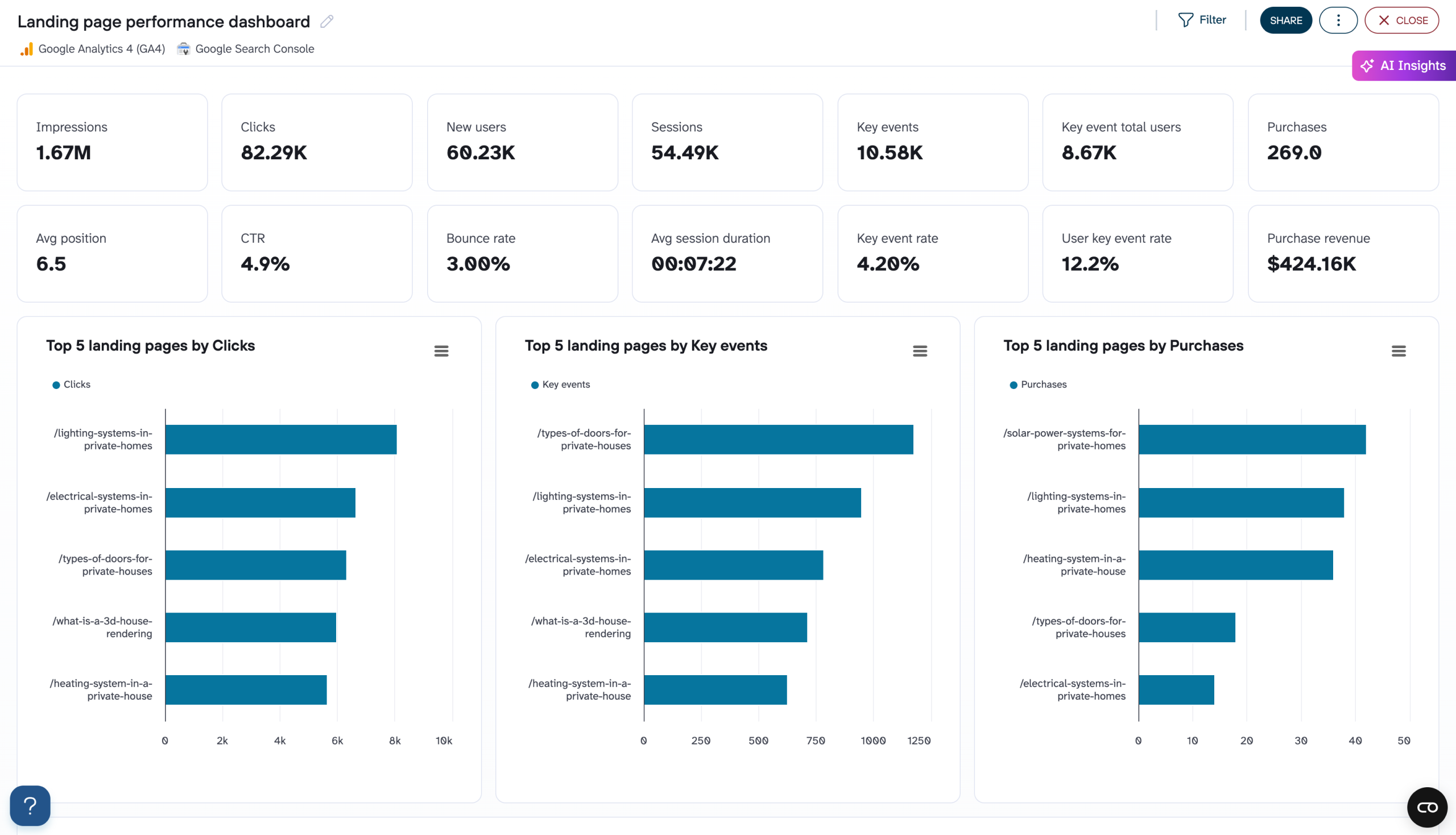
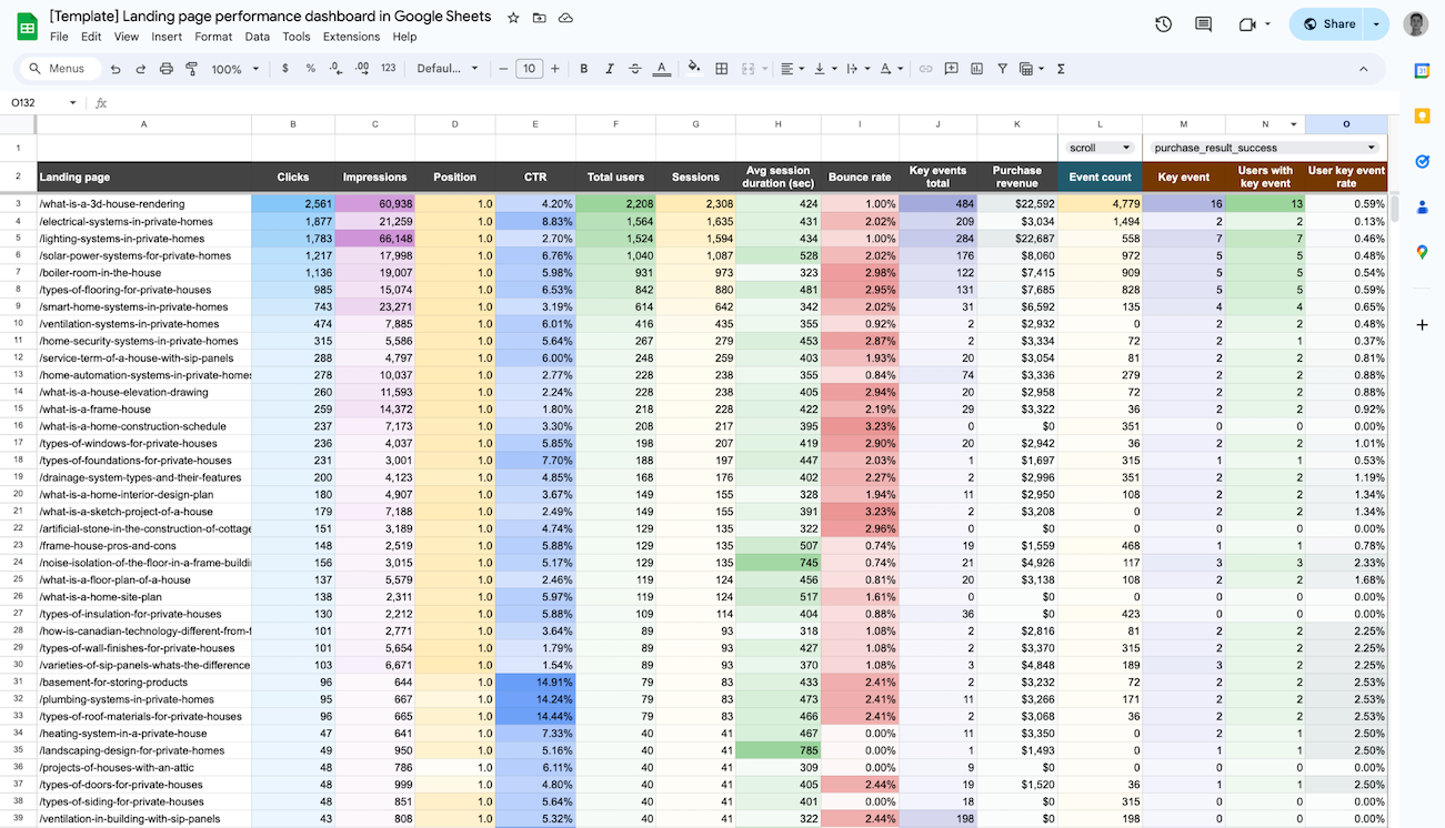
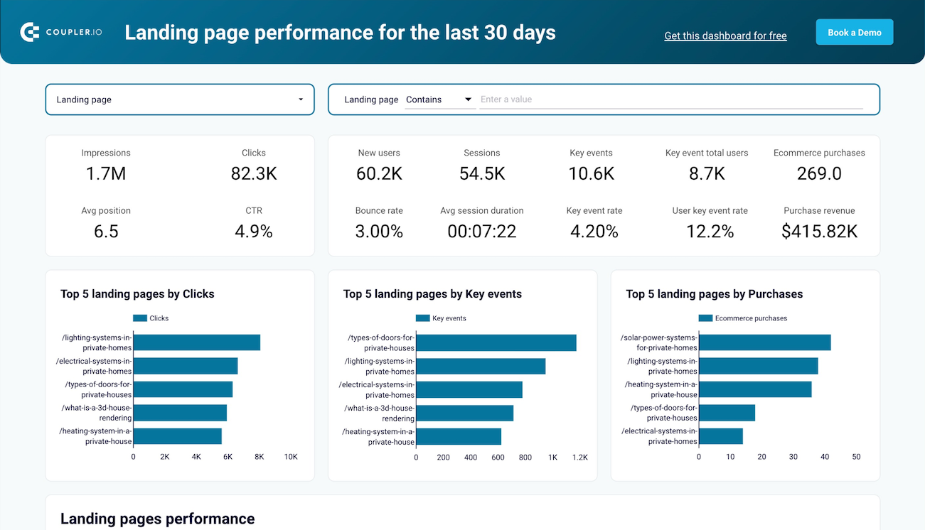
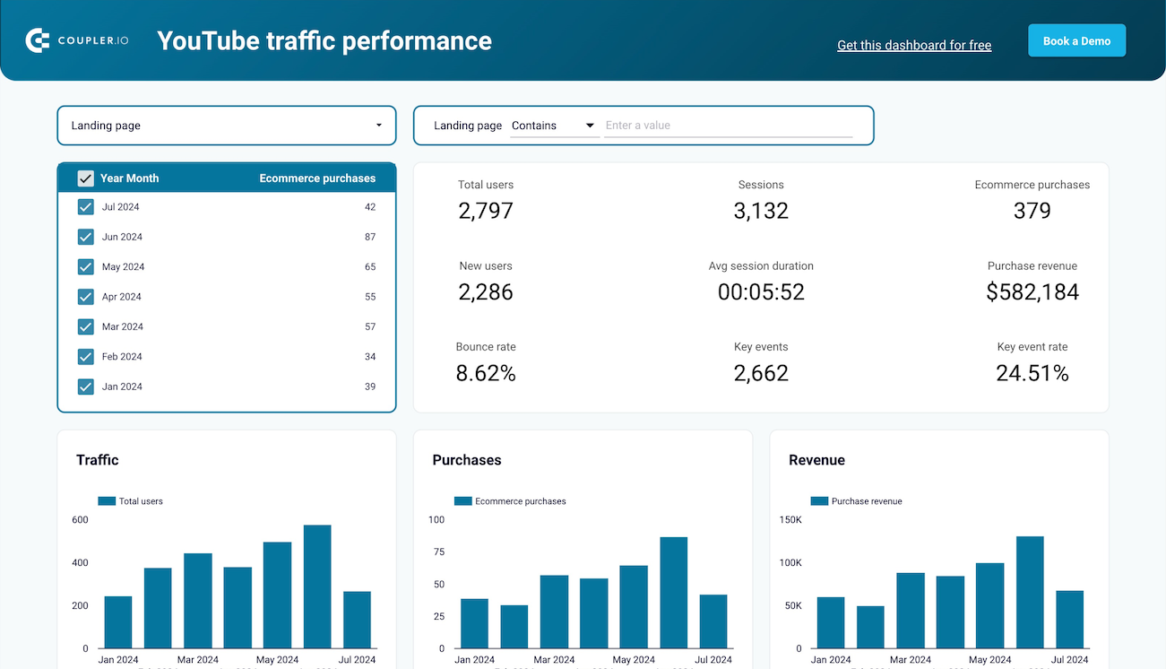
The landing page performance report evaluates the effectiveness of entry points to your website. It analyzes key metrics like impressions, clicks, conversion rates, and average position for each landing page. This report combines GA4 data with Google Search Console insights to provide a complete picture of both traffic volume and quality. By identifying your highest and lowest-performing landing pages, you can prioritize optimization efforts and refine content to better meet user expectations and business objectives. A Tableau web analytics dashboard can render these multi-dimensional landing page analyses with exceptional clarity and depth.
What insights you can get with the web analytics reporting dashboard

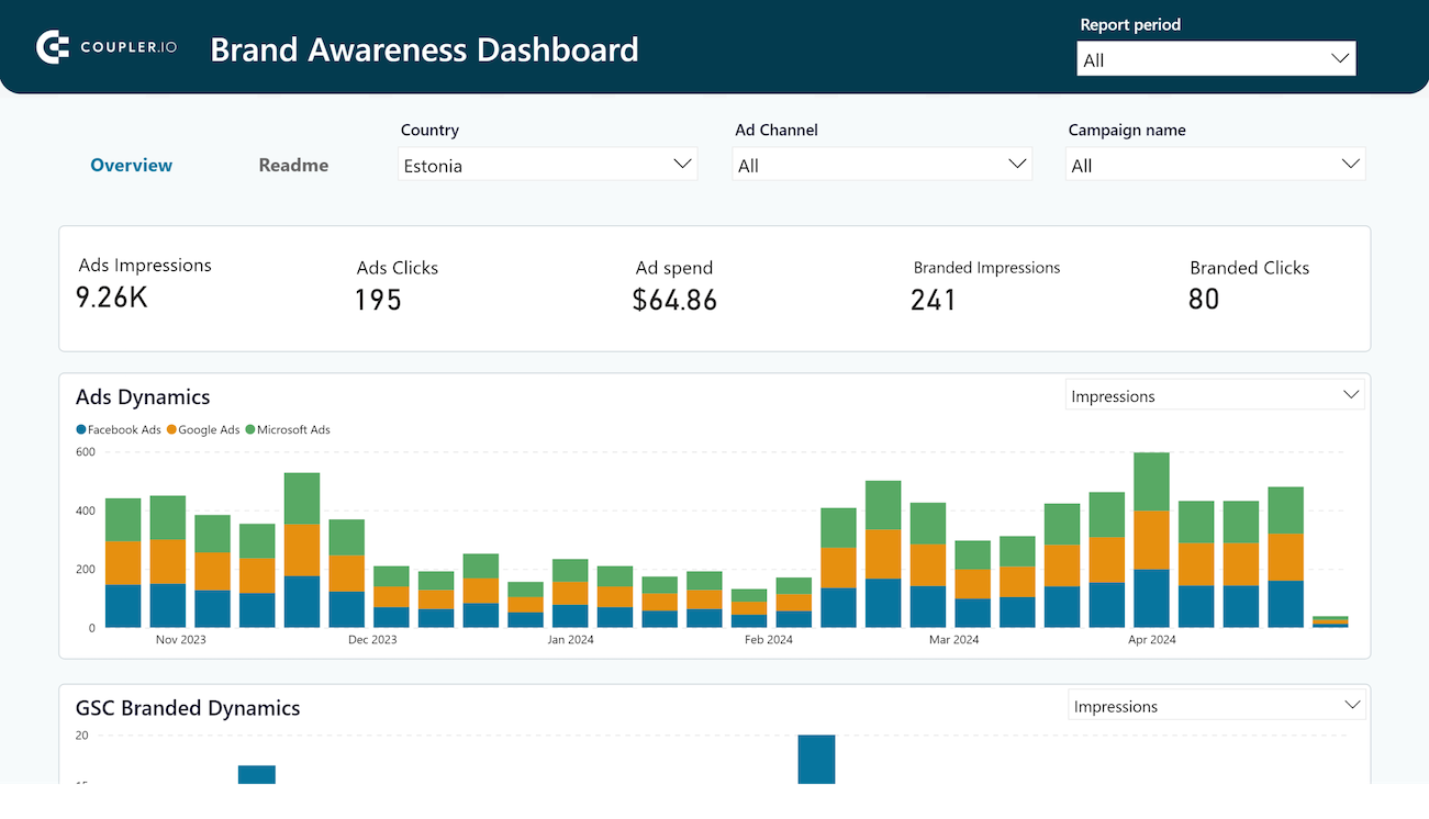
The channel group breakdown reveals which marketing efforts drive your website traffic with a clear visualization of sessions from organic search, paid advertising, social media, email, direct visits, and referrals. This insight helps you understand which channels deliver the most sessions and new users, allowing you to effectively allocate marketing resources to the most productive channels and identify underperforming areas that need optimization.
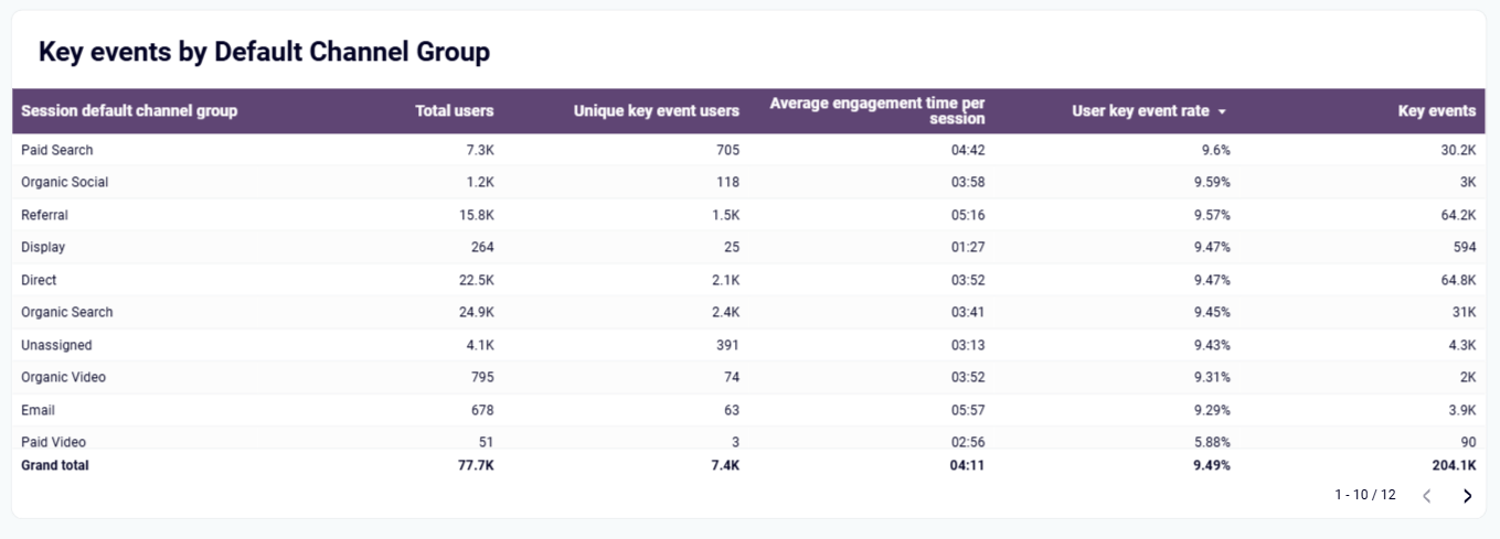
This insight reveals which marketing channels drive not just traffic, but meaningful conversions that impact your business. By focusing specifically on users who completed key events, it shows which channels deliver the highest-value visitors. This data helps you refine your marketing mix based on conversion value rather than just traffic volume, ensuring your budget is allocated to channels that genuinely drive business results.
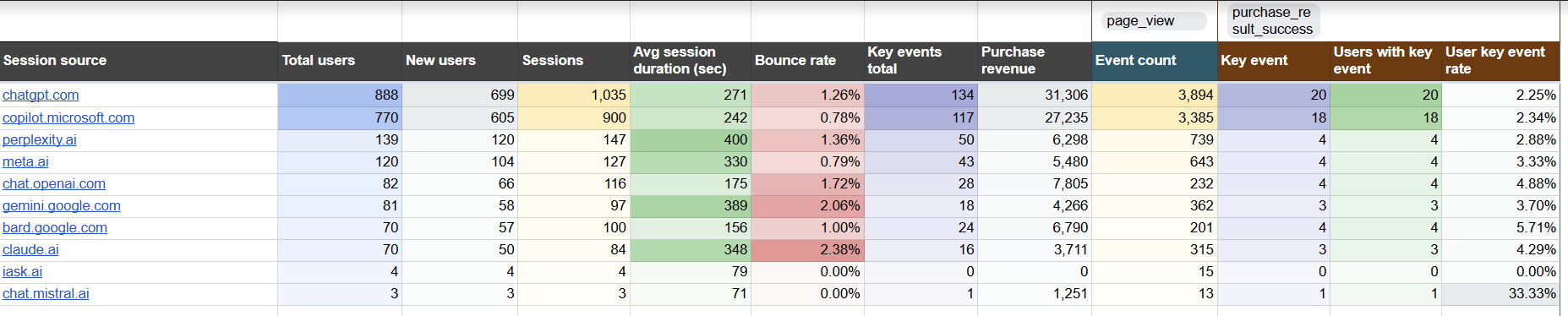
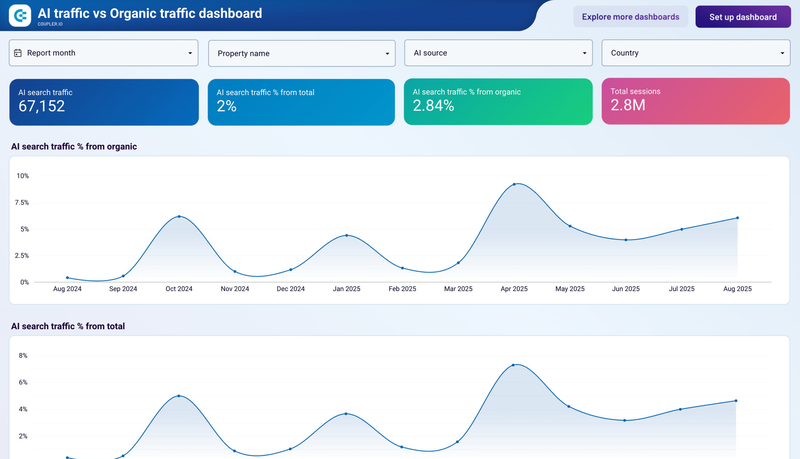
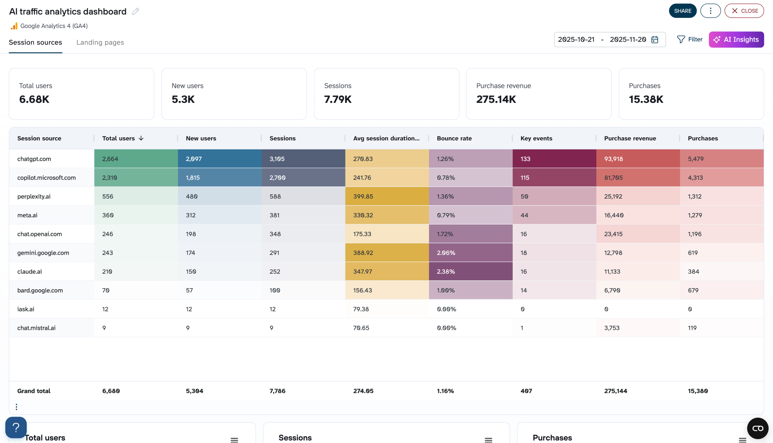
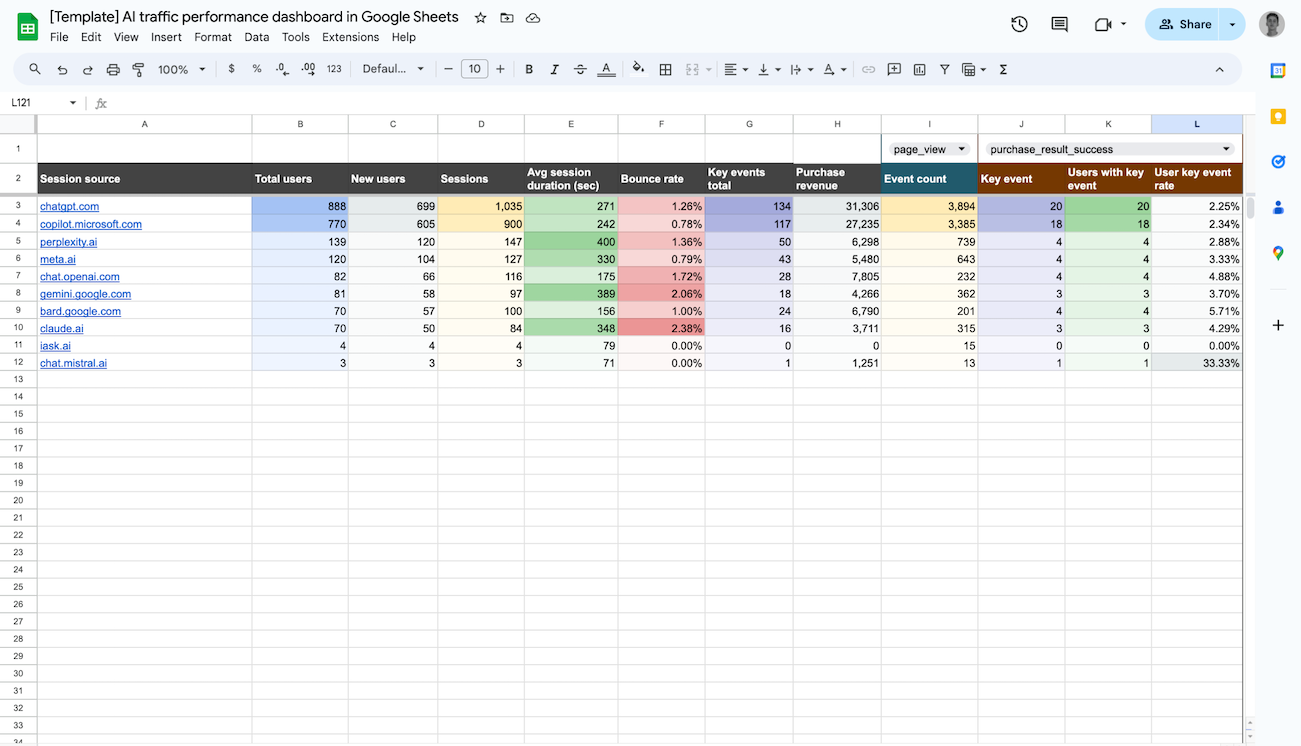
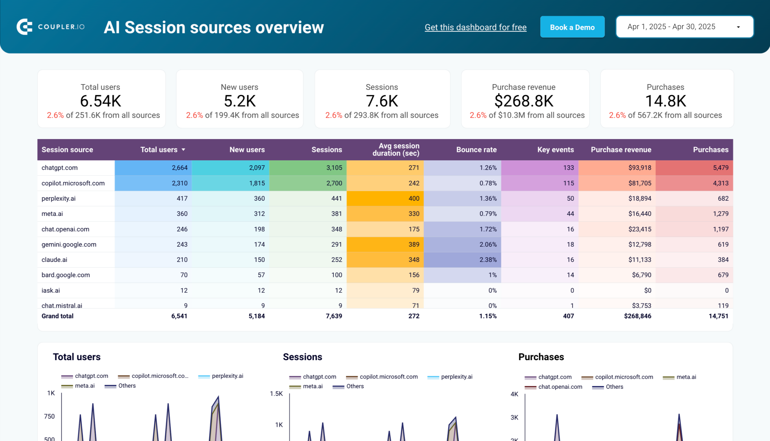
The AI traffic performance analysis shows how visitors from AI platforms like ChatGPT and other AI tools interact with your site. You can track which AI sources drive the most traffic, which landing pages receive AI-referred visitors, and how these users convert compared to other channels. This emerging traffic source provides unique insight into how AI tools are recommending your content and the value these new traffic streams bring to your business. Google Sheets web analytics dashboard solutions make this channel analysis accessible even to teams without dedicated data analysts.
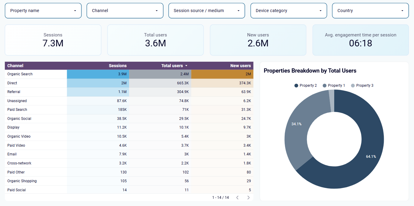
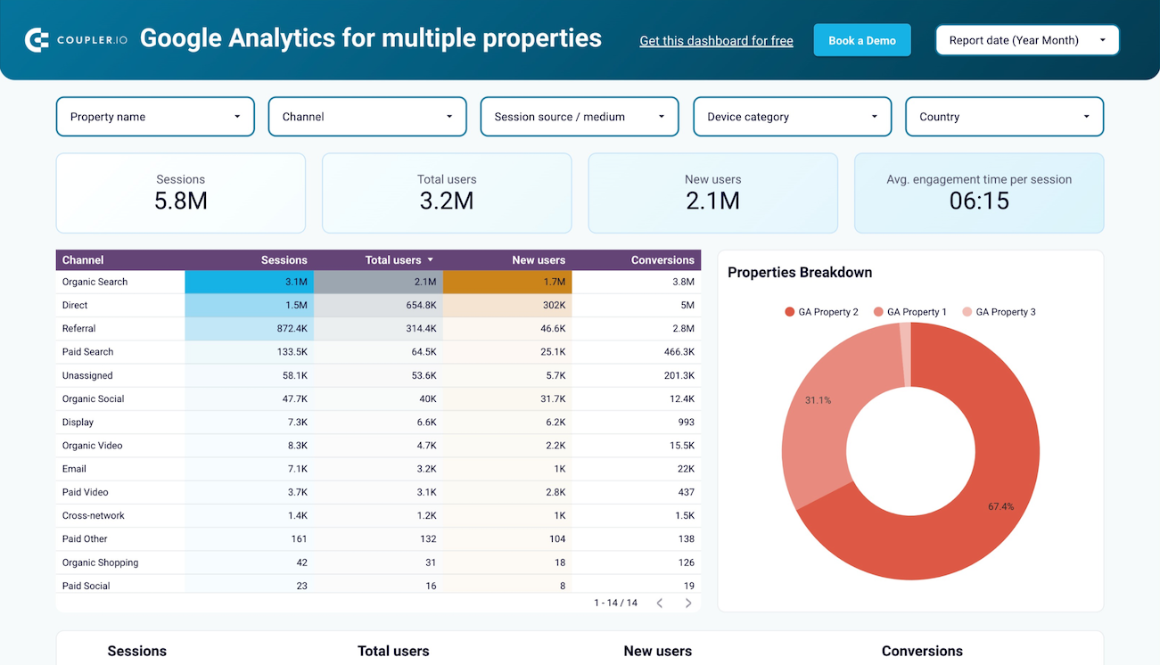
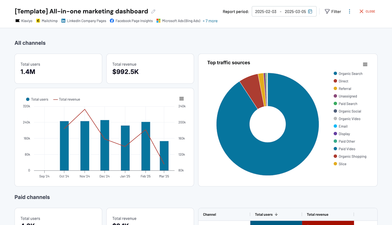
The multi-property overview consolidates metrics from all your websites into a single unified dashboard, eliminating the need to switch between multiple Google Analytics properties. You can compare traffic trends, engagement metrics, and conversion rates across different web properties simultaneously. This comprehensive view is especially valuable for agencies managing multiple client websites or organizations with several branded web properties.
How to create web analytics dashboards?

Metrics you can track with the web analytics dashboard template
More Web Analytics Dashboards
Request custom dashboard
From building custom dashboards to setting up data analytics from scratch, we're here to help you succeed. Contact us to discuss your case and possible solutions
Contact us