Email marketing dashboard examples and reporting templates
Maximize your email campaign effectiveness with automated email marketing dashboards that consolidate data from Klaviyo, Mailchimp, and GA4. Track email performance funnels, monitor campaign traffic, analyze engagement metrics, and make strategic decisions based on real-time insights from your email marketing platforms.
Email marketing dashboard examples for every need


 +6
+6


 +5
+5

 +6
+6


about your case. It doesn't cost you a penny 😉
What is an email marketing dashboard?
Modern email marketing reporting dashboards go beyond basic engagement metrics by connecting campaign performance directly to business outcomes. With automated data refreshing through Coupler.io, these Looker Studio email marketing dashboards ensure you're always working with the most current information without manual data entry. This creates a single source of truth for evaluating campaign success, optimizing future messaging, and demonstrating ROI to stakeholders.

Choose your Email marketing dashboard template to kick off
What reports should be included on a meaningful email marketing dashboard?
A comprehensive dashboard for email marketing should include several key reports that provide complete visibility into your campaign performance. Based on our analysis of Mailchimp and Klaviyo-based dashboards, we recommend incorporating these four essential report types:
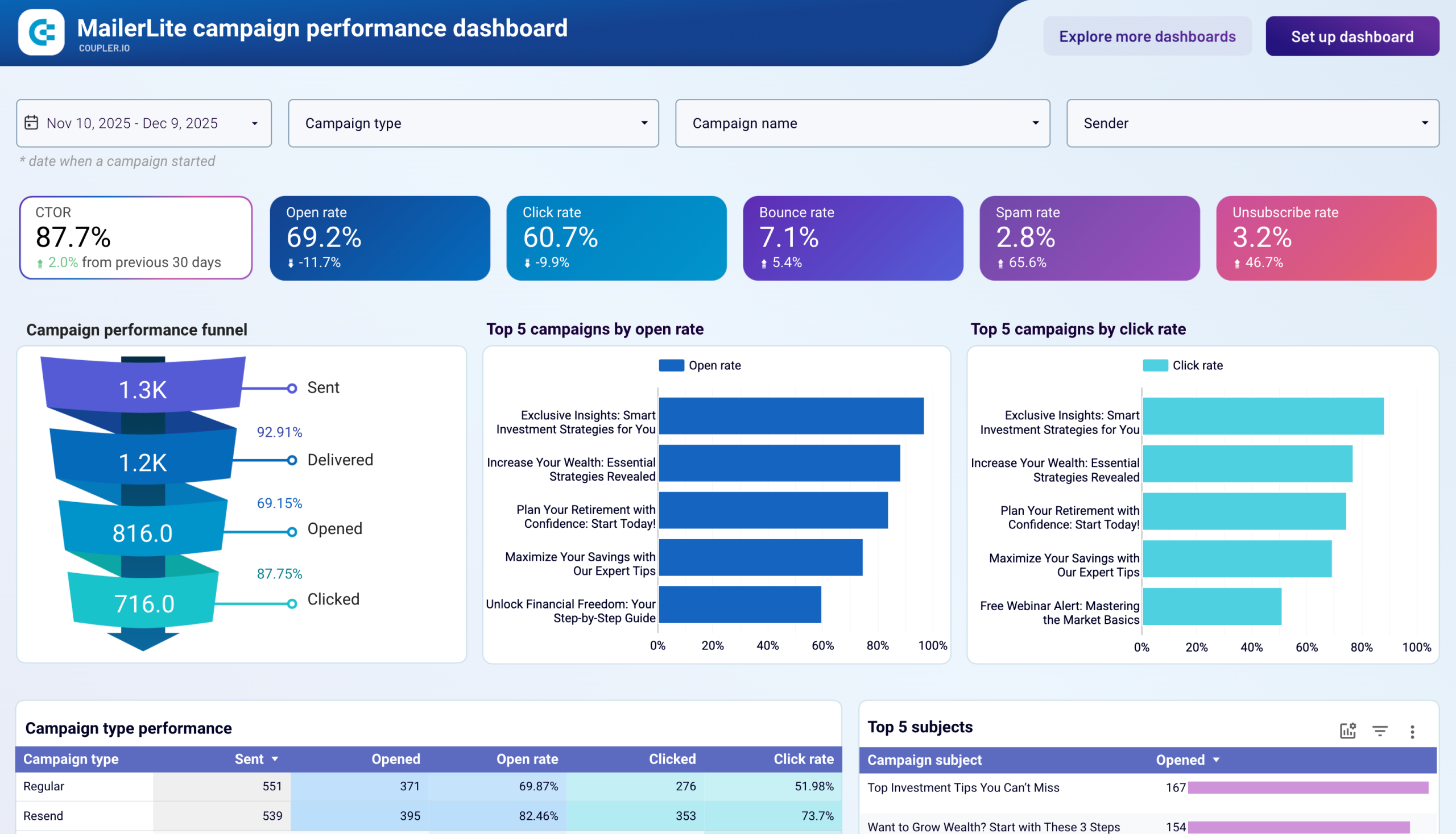
The email engagement analysis report provides a detailed breakdown of key interaction metrics from your email marketing platform. It tracks opens, clicks, unsubscribes, and bounces for each campaign, allowing you to compare effectiveness across different messaging types. The report highlights your best-performing days and times for sending emails, as well as your top-performing subject lines. This intelligence enables you to optimize future campaign scheduling and content strategies for maximum audience engagement.
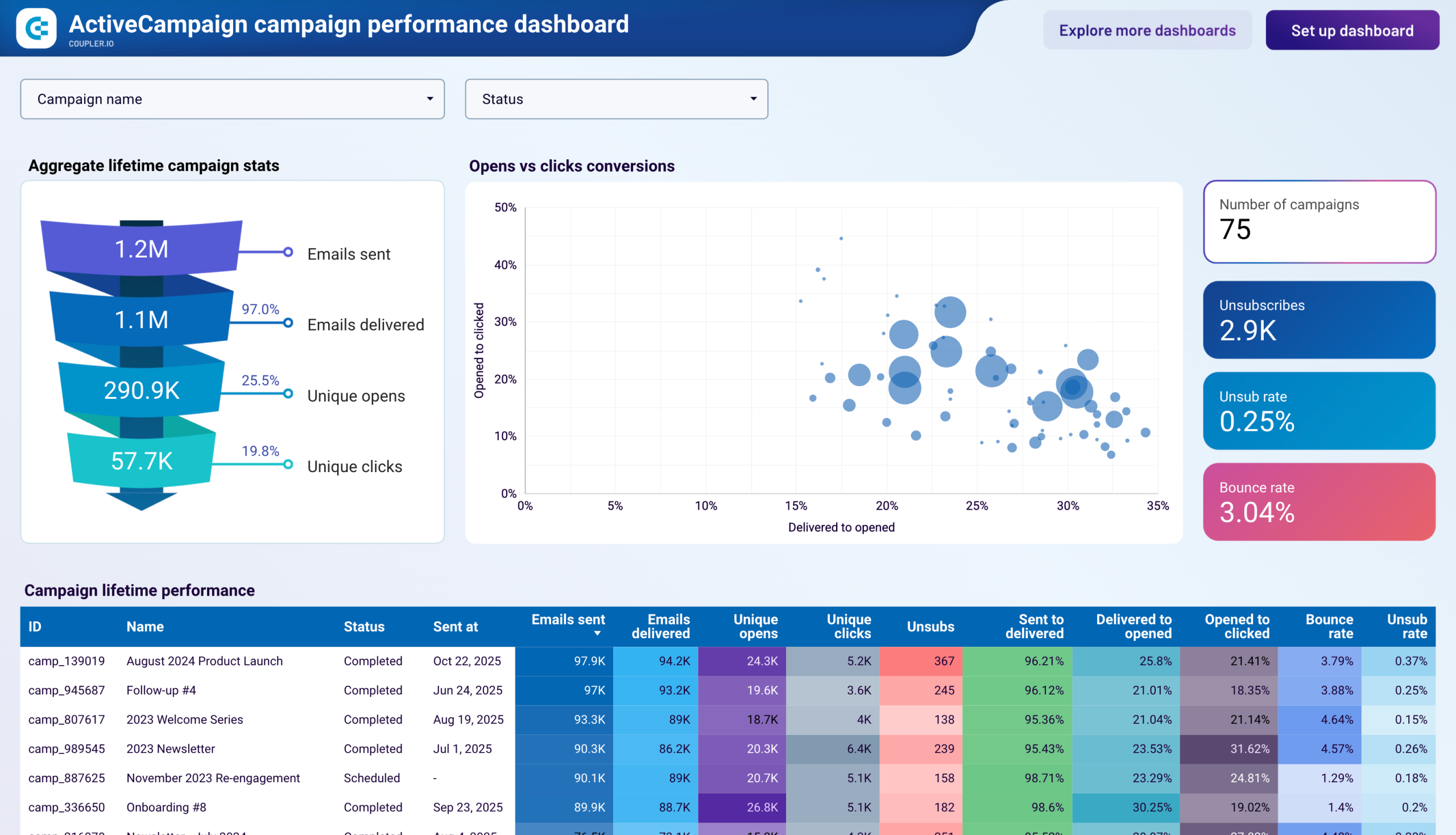
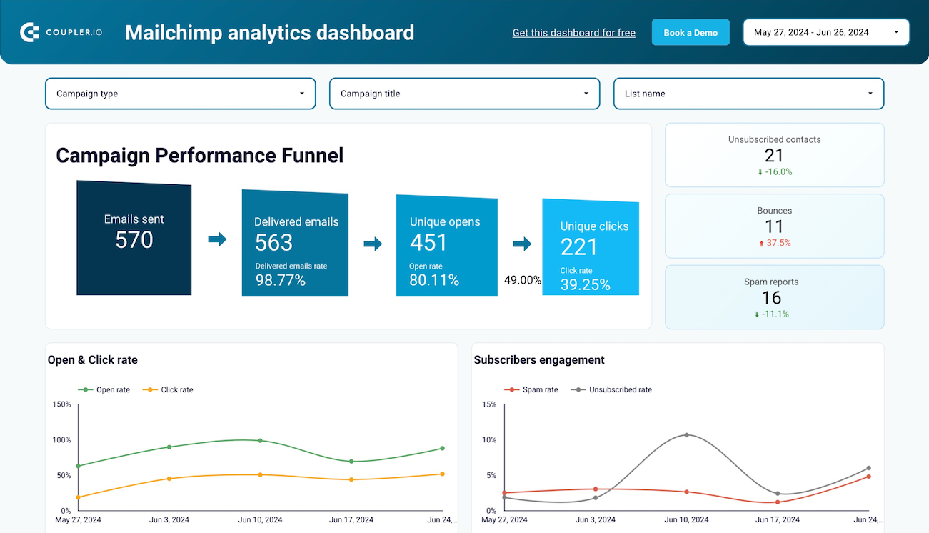
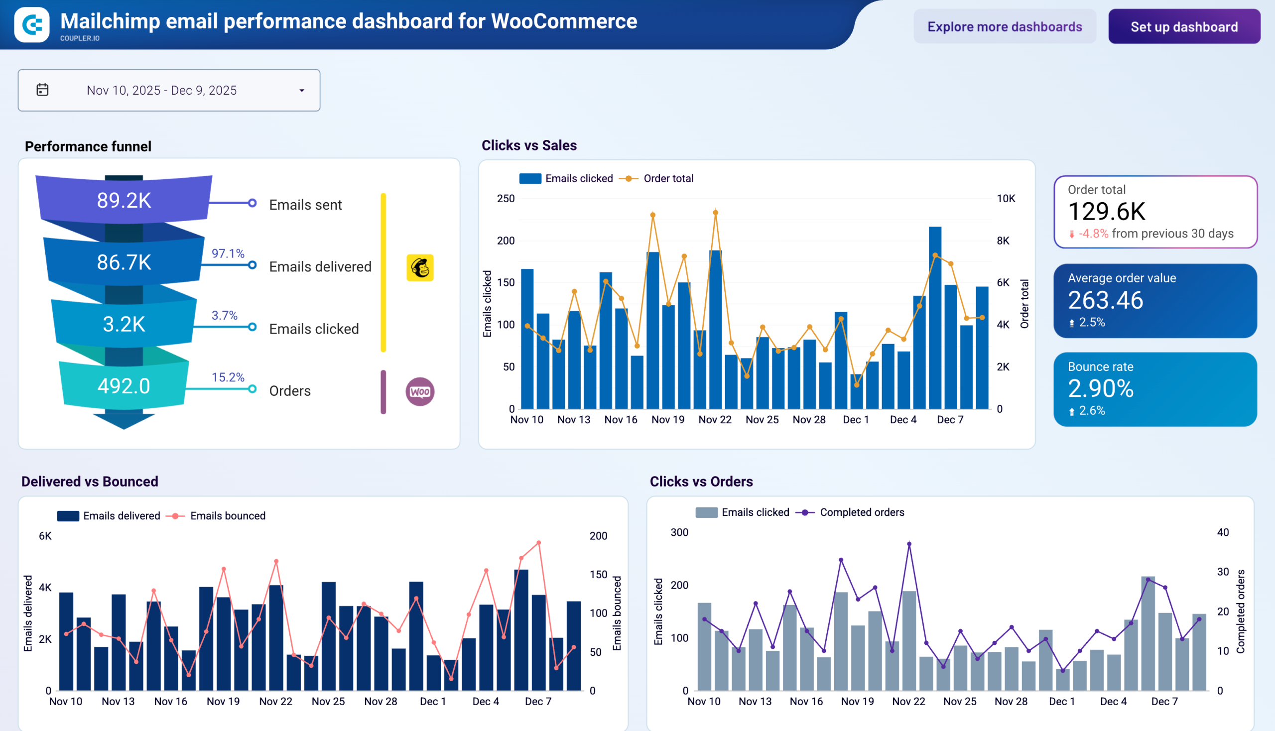
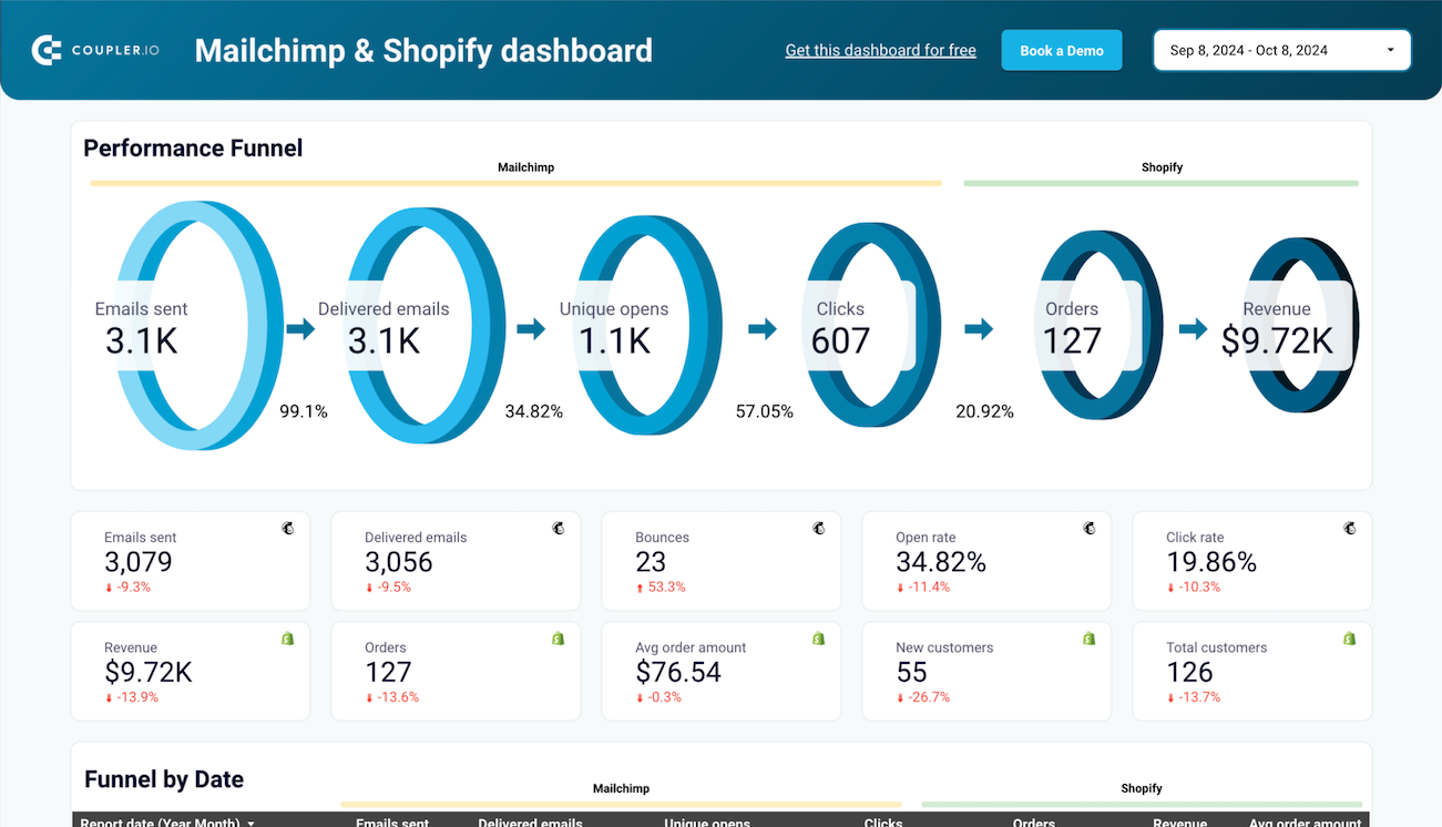
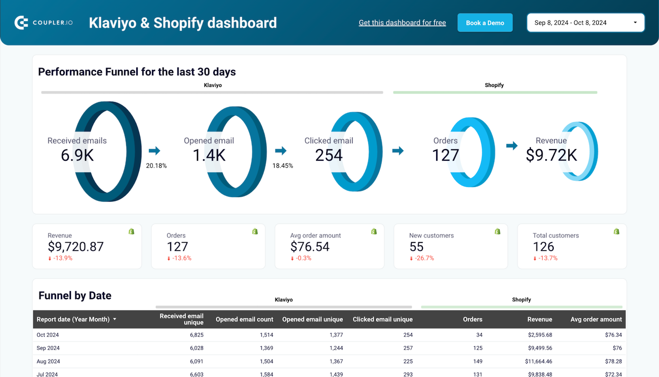
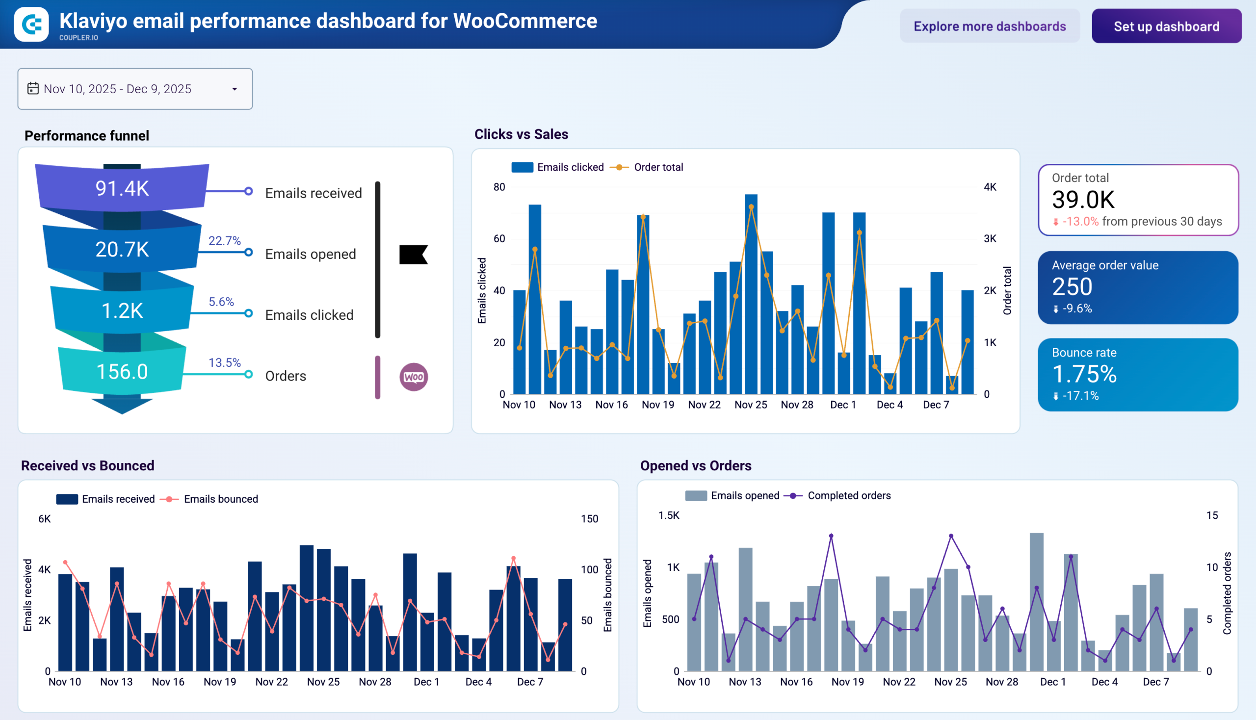
The email-to-revenue funnel report visualizes the complete customer journey from email delivery to purchase completion. It shows exactly where potential customers drop off – whether at the open, click, or purchase stage – helping you identify specific points for improvement. This report directly connects email activities to revenue generation, making it invaluable for demonstrating campaign ROI and justifying marketing investments to stakeholders.
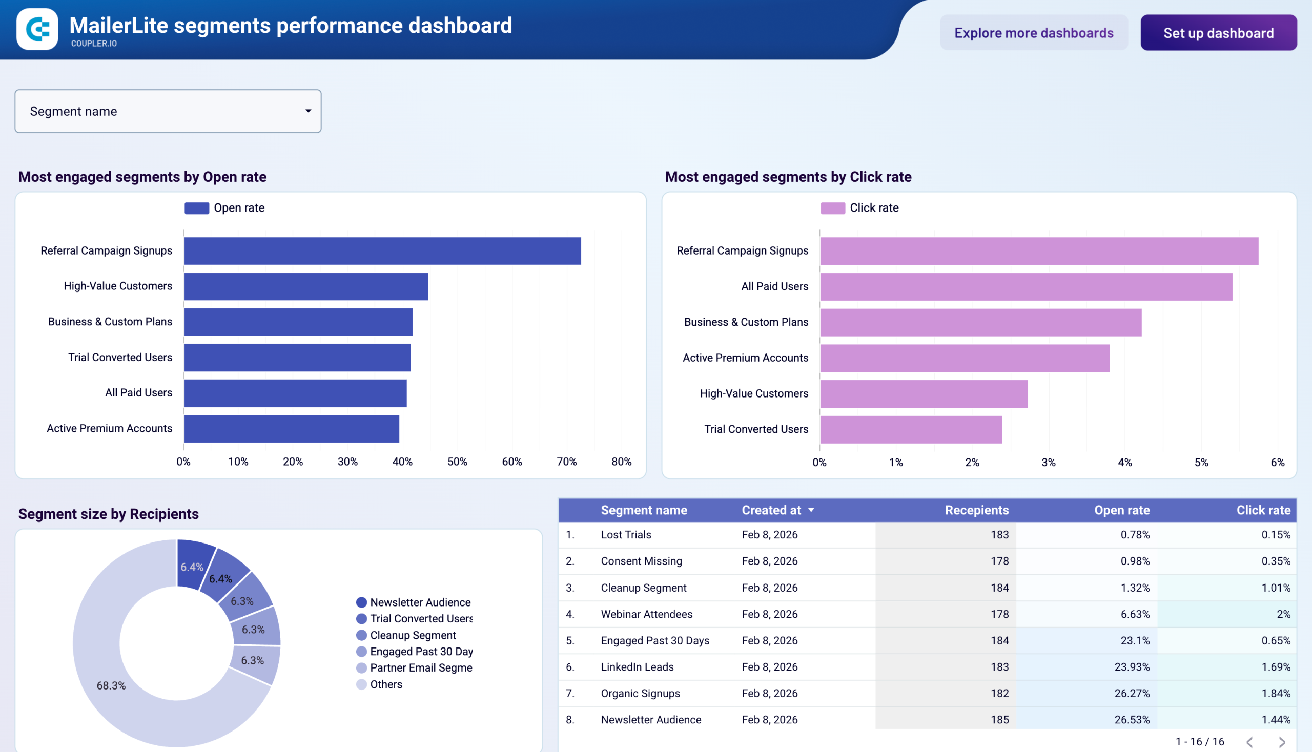
The unsubscribe trend monitoring report tracks patterns in subscriber opt-outs over time, by campaign type, and by audience segment. It helps you identify spikes in unsubscribes that might indicate issues with content relevance, sending frequency, or audience targeting. By analyzing these patterns, you can make proactive adjustments to your email strategy before subscriber losses impact your marketing reach and effectiveness.
The campaign performance comparison report provides side-by-side analysis of multiple email campaigns, allowing you to identify your highest and lowest performers across key metrics. By comparing open rates, click rates, conversion metrics, and revenue generation between different campaign types, you can isolate the variables that contribute most to success. This insight drives continuous improvement in your email marketing strategy by highlighting what works and what doesn't.
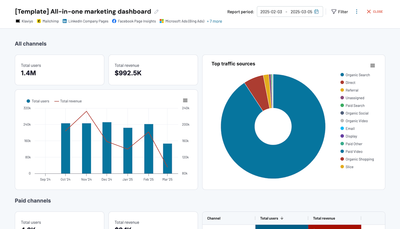
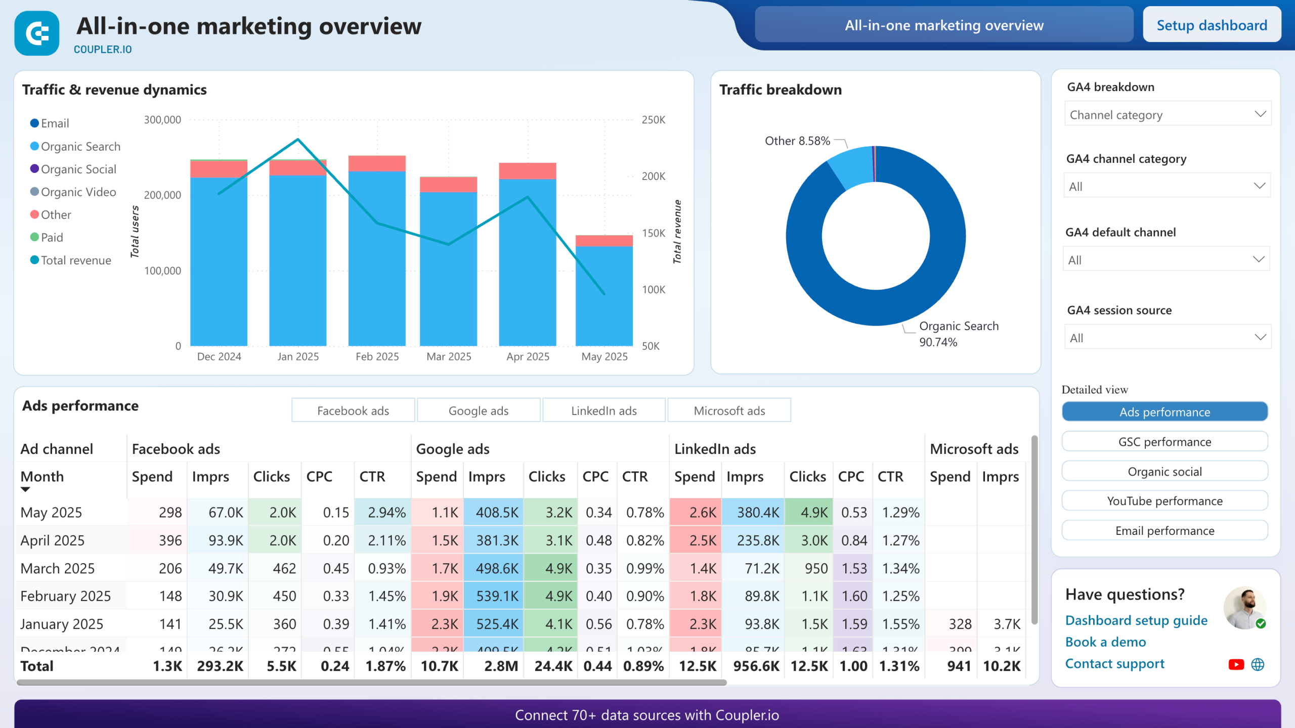
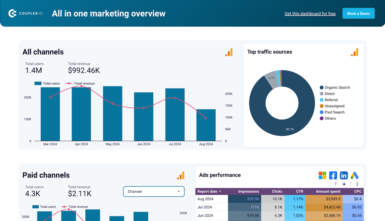
What insights you can get with the email marketing reporting dashboard
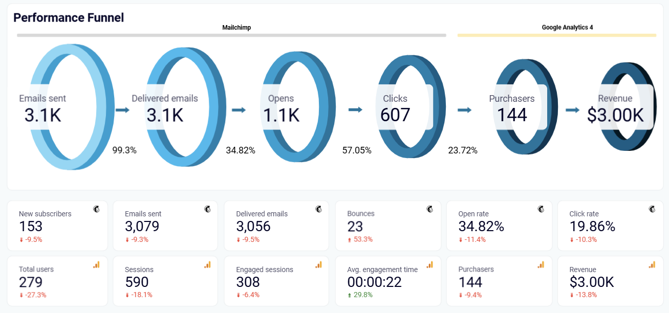
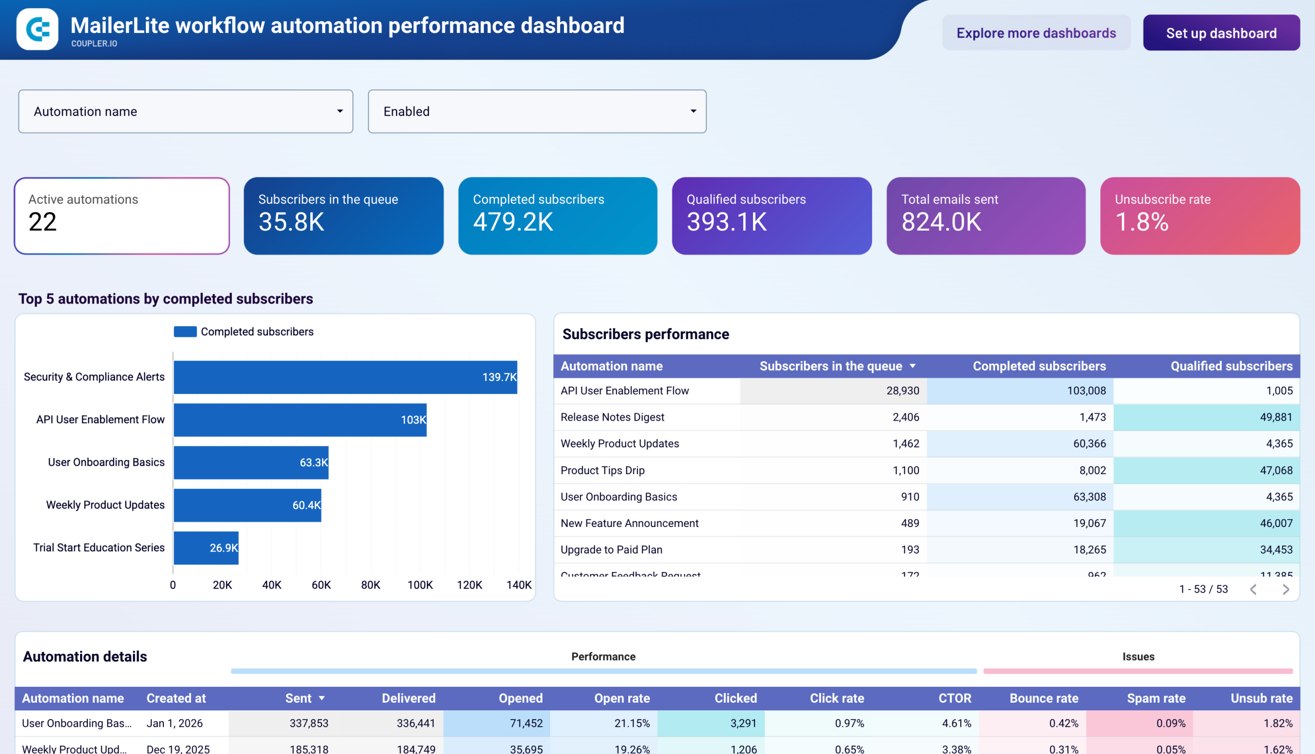
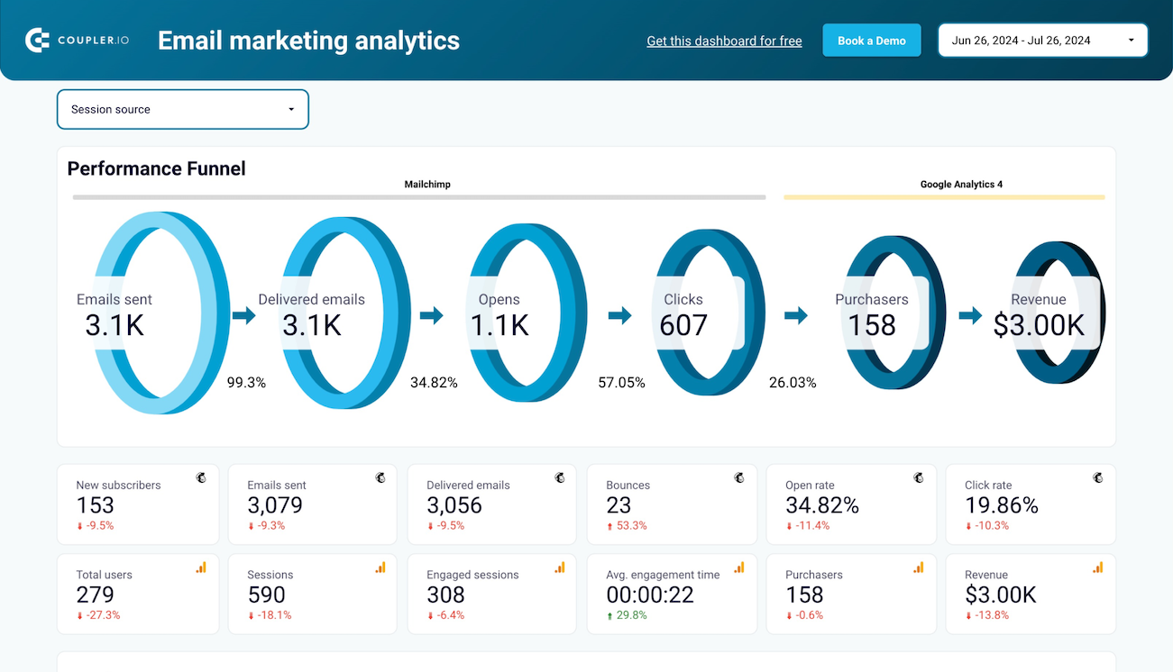
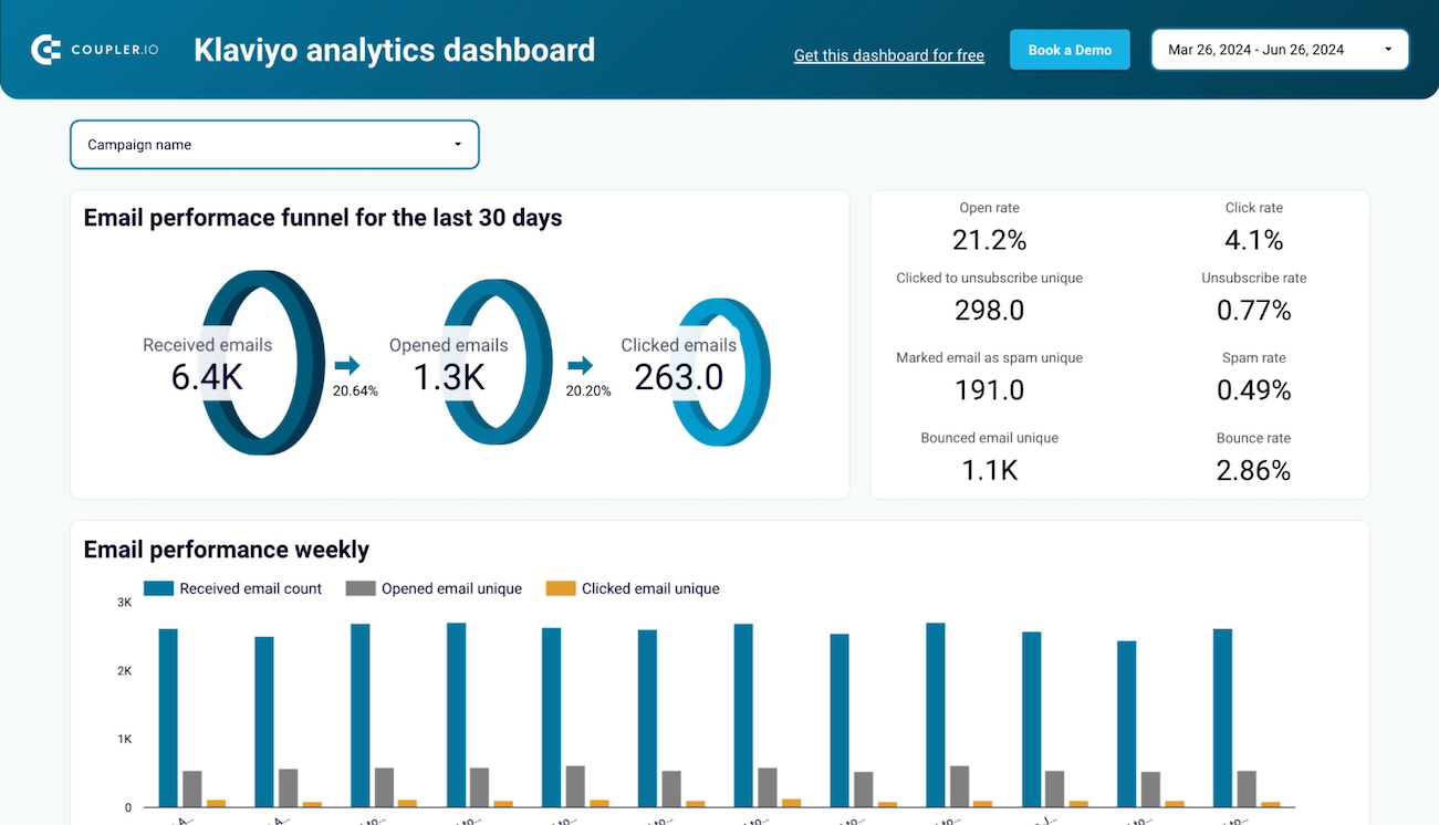
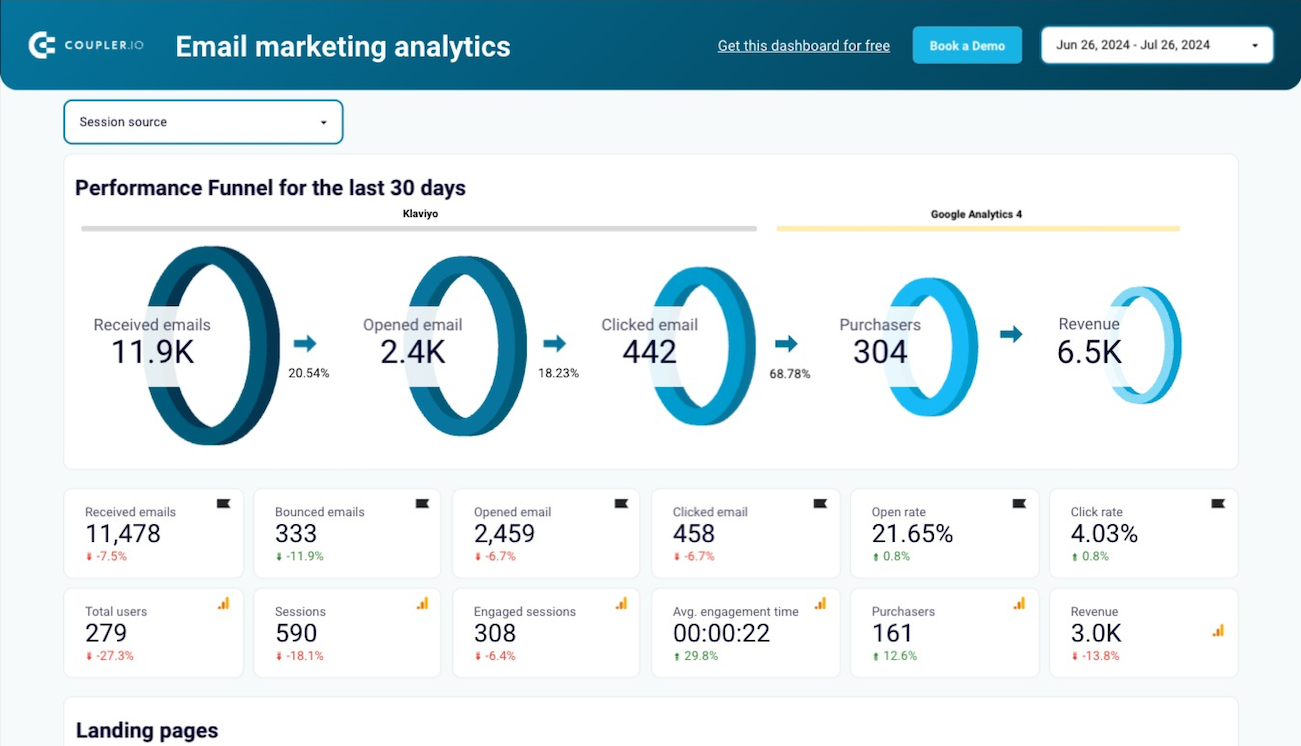
The email performance funnel provides a clear visualization of your entire email marketing process, from emails sent and delivered to opened, clicked, and ultimately converted into purchases and revenue. This comprehensive view helps identify where potential customers drop off in your funnel, allowing you to focus optimization efforts on specific stages. By comparing current performance against benchmarks, you can quickly spot underperforming areas requiring attention.
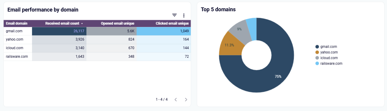
The email performance by domain analysis breaks down engagement metrics based on subscribers' email service providers. This visualization helps you understand how your campaigns perform across different email domains like Gmail, Yahoo, Outlook, and corporate servers. By identifying domain-specific patterns, you can adapt your email design and content to overcome platform-specific challenges, such as image rendering issues or spam filtering tendencies in certain domains.
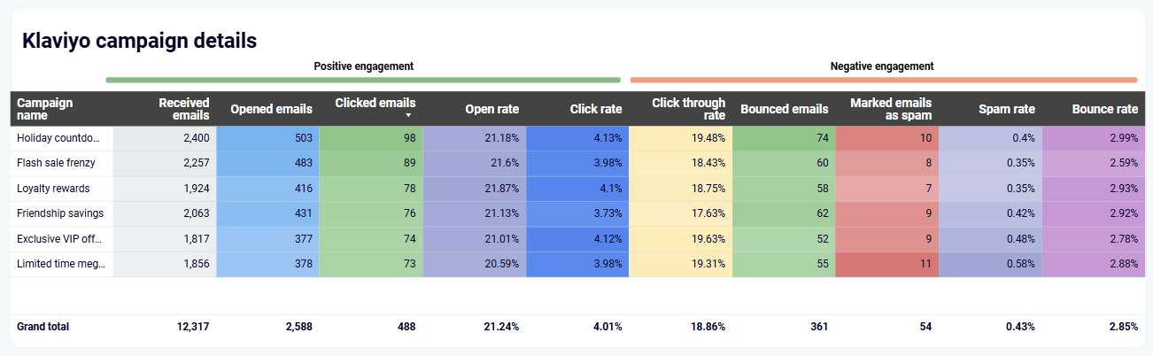
The campaign engagement performance section provides a comprehensive view of how recipients interact with your emails beyond basic opens and clicks. It showcases detailed metrics on positive engagement like opens and clicks, as well as negative indicators (bounce, spam reports). This nuanced understanding of audience response helps identify which content resonates most effectively with different segments, enabling more targeted messaging strategies.
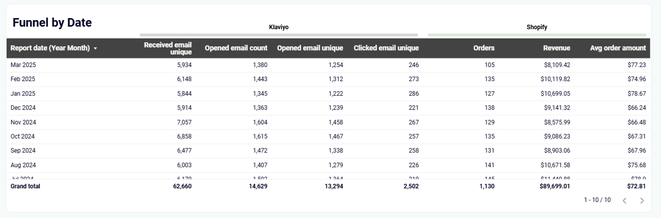
The funnel by date analysis provides a time-based view of how your email marketing performance evolves throughout the week or month. This dynamic table shows how metrics like delivered emails, opens, clicks, orders, and revenue fluctuate over time, revealing seasonal patterns and day-of-week trends. By identifying when your audience is most receptive, you can optimize send timing, plan promotional calendars, and schedule your most important campaigns during historically high-engagement periods.
How to create email marketing dashboards?

Metrics you can track with the email marketing dashboard template
Request custom dashboard
From building custom dashboards to setting up data analytics from scratch, we're here to help you succeed. Contact us to discuss your case and possible solutions
Contact us